


- Zniszcz tę szaloną bestię Plakat
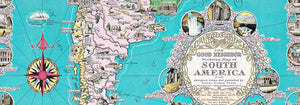
- Dobry sąsiad Ameryki Południowej Plakat
- Włochy i Watykan Plakat
- Les Lalanne Plakat
- Tańcząca para w śniegu Plakat
- Jet Clipper na Hawaje Plakat
- Kohler Chocolat Plakat
- Złodziej truskawek Plakat
- Tańczące postacie Matisse'a Plakat
- Plakat wystawowy Toma Krojera Plakat
- Berlin Street Scene Plakat
- Wystawa Ernsta Kirchnera Plakat
- Siedząca kobieta od tyłu Plakat
- Rude włosy, niebieski kapelusz Plakat
- Park Near Lu Plakat
- El Comienzo Plakat
- Parler Seul 2 Plakat
- Pierścień zmierzchu Plakat
- Parler Seul Plakat
- Sen Plakat
- Le Concert Plakat
- Artystka Plakat
- Revenge of the Pink Panther Plakat
- Kobieta i ptak nocą Plakat
- Odwiedź Puerto Rico Plakat
- Bauhaus 20 Plakat
- Bauhaus 21 Plakat
- Jedz więcej owoców Plakat
- Niebieski japoński żuraw Plakat
- Snoopy Come Home Plakat
- To London by Jet Clipper Plakat
- Crans Plakat
- Monte Carlo Plakat
- Pacific Vibrations Plakat
- Continental Hawaii Airline Plakat
- Piwo i papieros Plakat
- Zachodnie wybrzeże Meksyku Plakat
-
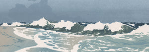
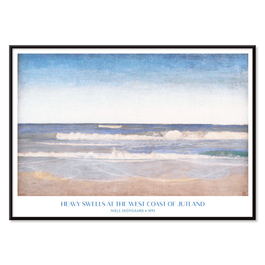
West Coast of Jutland Poster
Niels Skovgaard · 1894 · Coastal seascape poster with rolling North Sea swells beneath a pale, windy sky
Plakat od 40,50 zł · W ramce od 72 zł
Cena regularna Od 27,00 złCena regularna -
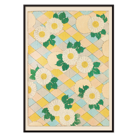
Bijutsukai Pl.218 Poster
Korin Furuya · 1901 · Stylized chrysanthemum poster balanced by soft geometric blocks and airy negative space
Plakat od 40,50 zł · W ramce od 72 zł
Cena regularna Od 27,00 złCena regularna -
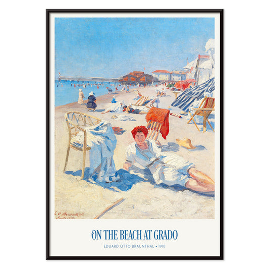
On the beach at Grado Poster
Eduard Otto Braunthal · 1910 · Sunlit Grado beach poster with relaxed bathers, crisp seaside blues and warm reds
Plakat od 40,50 zł · W ramce od 72 zł
Cena regularna Od 27,00 złCena regularna -
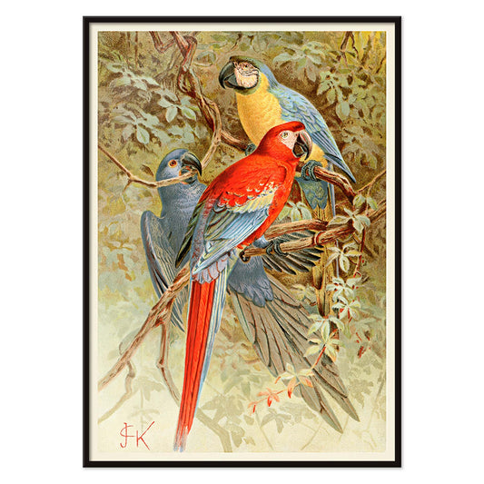
Macaws Poster
Unknown artist · 1893 · Vivid macaws print with lush rainforest foliage and crisp natural history detail
Plakat od 40,50 zł · W ramce od 72 zł
Cena regularna Od 27,00 złCena regularna -
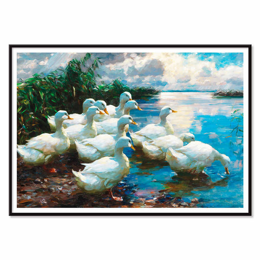
Ducks by a lake Poster
Alexander Koester · 1892 · Serene art print of white ducks gliding on reflective water in a tranquil landscape
Plakat od 40,50 zł · W ramce od 72 zł
Cena regularna Od 27,00 złCena regularna -
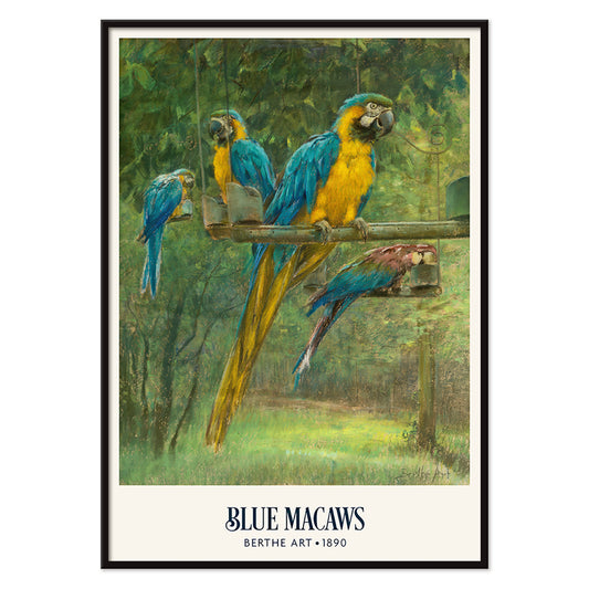
Blue Macaws Poster
Berthe Art · 1890 · Vibrant macaw poster with blue and yellow plumage amid dense tropical foliage
Plakat od 40,50 zł · W ramce od 72 zł
Cena regularna Od 27,00 złCena regularna -
Peacock And Peacock Butterfly Poster
Archibald Thorburn · 1899 · Naturalistic peacock and butterfly print balancing jewel tones with quiet Victorian poise
Plakat od 40,50 zł · W ramce od 72 zł
Cena regularna Od 27,00 złCena regularna -
Swimming Polyps Poster
Institute of Liepzig · 2018 · Intricate marine scientific print of swimming polyps and jellyfish in cool sea tones
Plakat od 40,50 zł · W ramce od 72 zł
Cena regularna Od 27,00 złCena regularna -
Planiglobes of the Earth I Poster
Institute of Liepzig · 1860 · Detailed hemispheric world map vintage print with crisp graticules and antique typography
Plakat od 40,50 zł · W ramce od 72 zł
Cena regularna Od 27,00 złCena regularna -
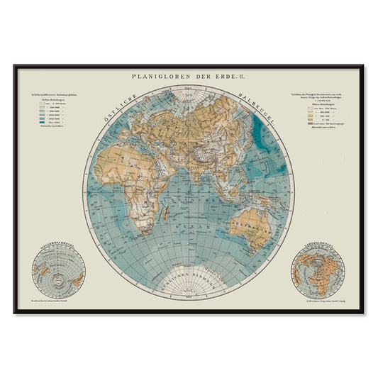
Planiglobes of the Earth II Poster
Institute of Liepzig · 1894 · Detailed double-hemisphere vintage print with antique cartography and fine latitude grid
Plakat od 40,50 zł · W ramce od 72 zł
Cena regularna Od 27,00 złCena regularna -
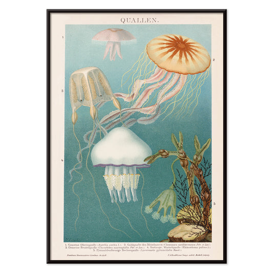
Jellyfish Poster
Institute of Liepzig · 2017 · Luminous jellyfish poster floating on deep blue with delicate trailing tentacles
Plakat od 40,50 zł · W ramce od 72 zł
Cena regularna Od 27,00 złCena regularna -
Cloud Shapes Poster
Institute of Liepzig · 1972 · Vintage cloud taxonomy poster featuring labeled formations and precise scientific illustration
Plakat od 40,50 zł · W ramce od 72 zł
Cena regularna Od 27,00 złCena regularna -
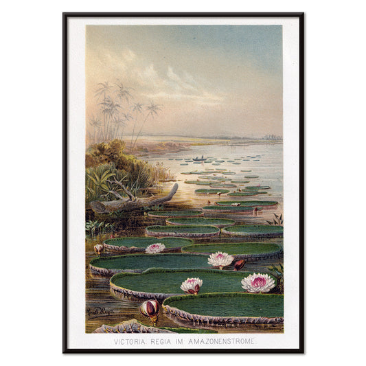
Nenufar in Amazon Forest Poster
Institute of Liepzieg · 2017 · Serene Amazon water lily poster with lush greenery and soft pink blooms
Plakat od 40,50 zł · W ramce od 72 zł
Cena regularna Od 27,00 złCena regularna -
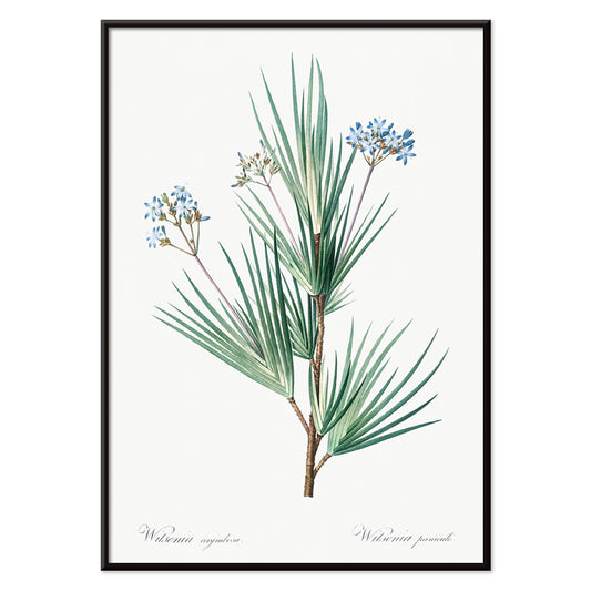
Blue stars Poster
Pierre-Joseph Redouté · 1805 · Delicate blue starflower botanical print with slender leaves on a clean white ground
Plakat od 40,50 zł · W ramce od 72 zł
Cena regularna Od 27,00 złCena regularna -
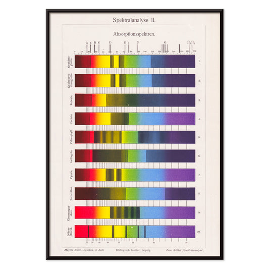
Spectral Analysis Poster
The Institute of Liepzig · 1973 · Vibrant spectral bars poster echoing lab charts with crisp scientific geometry
Plakat od 40,50 zł · W ramce od 72 zł
Cena regularna Od 27,00 złCena regularna -
Southern Sky Star Poster Poster
The Institute of Leipzig · 1854 · Detailed southern sky print featuring crisp star points and fine constellation lines
Plakat od 40,50 zł · W ramce od 72 zł
Cena regularna Od 27,00 złCena regularna -
Milky Way North Hemisphere Poster
Institute of Leipzig · 1949 · Detailed northern sky poster charting constellations across a luminous Milky Way band
Plakat od 40,50 zł · W ramce od 72 zł
Cena regularna Od 27,00 złCena regularna -
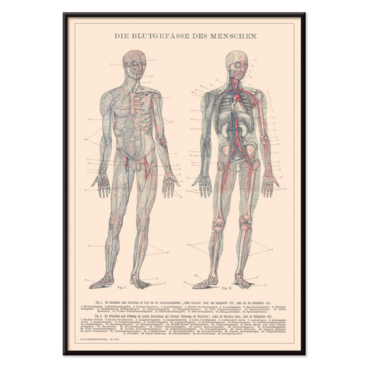
Human Blood System Poster
Institute of Liepzig · 1906 · Detailed anatomical poster mapping blood circulation with red and blue vessels on beige
Plakat od 40,50 zł · W ramce od 72 zł
Cena regularna Od 27,00 złCena regularna -
Billetes Bus Barcelona 2 Poster
Unknown artist · 1978 · Colorful Barcelona transit ticket vintage print with bold numbers and graphic accents
Plakat od 40,50 zł · W ramce od 72 zł
Cena regularna Od 27,00 złCena regularna -
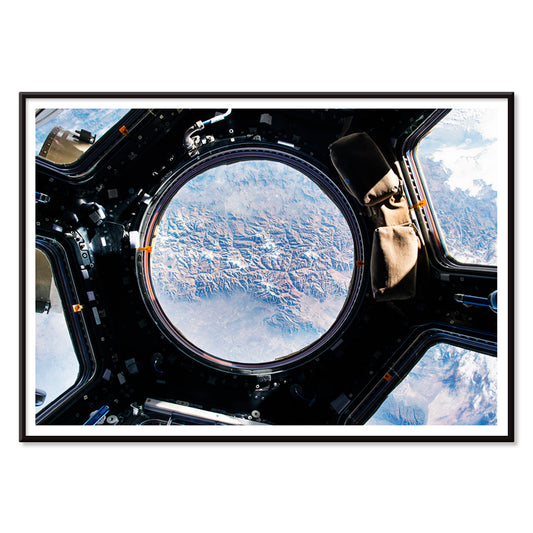
The Earth view from the ISS Poster
NASA · 2015 · Iconic Earth-from-orbit poster with luminous blue arc and drifting white cloud fields
Plakat od 40,50 zł · W ramce od 72 zł
Cena regularna Od 27,00 złCena regularna -
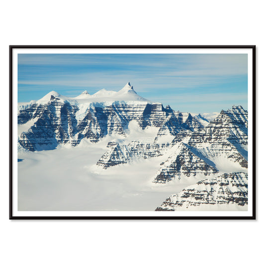
Geikie Plateau Poster
NASA · 2000 · Aerial Greenland mountain poster with snow ridges and dark basalt bands in blue shadows
Plakat od 40,50 zł · W ramce od 72 zł
Cena regularna Od 27,00 złCena regularna -
Soyuz MS-02 spacecraft Poster
NASA · 2017 · Dramatic Soyuz MS-02 landing poster showing capsule under parachute against wide Kazakh sky
Plakat od 40,50 zł · W ramce od 72 zł
Cena regularna Od 27,00 złCena regularna -
Soyuz TMA-14M spacecraft Poster
NASA · 2015 · Dramatic Soyuz capsule poster descending under an orange parachute against a wide blue sky
Plakat od 40,50 zł · W ramce od 72 zł
Cena regularna Od 27,00 złCena regularna -
Soyuz MS-02 spacecraft Poster
NASA · 2017 · Dramatic Soyuz MS-02 landing poster with capsule descending beneath an orange-and-white parachute
Plakat od 40,50 zł · W ramce od 72 zł
Cena regularna Od 27,00 złCena regularna -
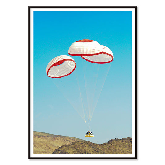
CST-100 crew capsule Poster
NASA · 2012 · Retro-futurist space capsule poster showing parachute descent over a desert landing zone
Plakat od 40,50 zł · W ramce od 72 zł
Cena regularna Od 27,00 złCena regularna -
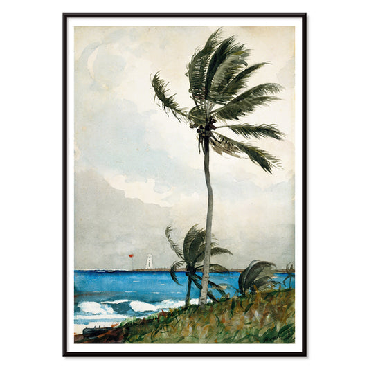
Palm Tree, Nassau Poster
Winslow Homer · 1898 · Breezy palm tree art print with calm shoreline and airy watercolor light
Plakat od 40,50 zł · W ramce od 72 zł
Cena regularna Od 27,00 złCena regularna -
The Buccaneers Poster
Winslow Homer · 1885 · Tropical seaside art print of youthful buccaneers beneath palms and bright coastal light
Plakat od 40,50 zł · W ramce od 72 zł
Cena regularna Od 27,00 złCena regularna -
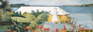
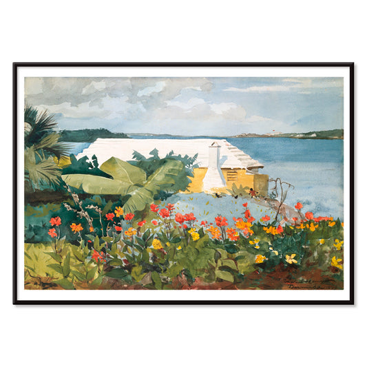
Flower Garden and Bungalow Poster
Winslow Homer · 1899 · Sunlit Bermuda garden art print with bright flowers leading to a quiet bungalow
Plakat od 40,50 zł · W ramce od 72 zł
Cena regularna Od 27,00 złCena regularna -
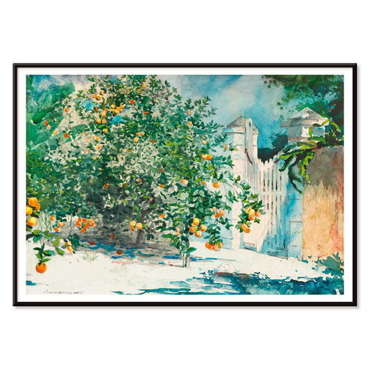
Orange Trees And Gate Poster
Winslow Homer · 1885 · Sunlit watercolor garden print with orange trees and a wooden gate
Plakat od 40,50 zł · W ramce od 72 zł
Cena regularna Od 27,00 złCena regularna -
Siphonophorae Poster
Ernst Haeckel · 1866 · Intricate siphonophore scientific print with floating forms in crisp blues and reds
Plakat od 40,50 zł · W ramce od 72 zł
Cena regularna Od 27,00 złCena regularna -
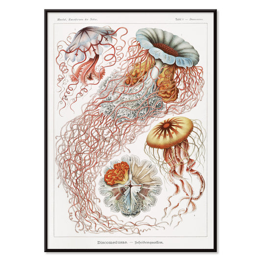
Discomedusae Poster
Ernst Haeckel · 1904 · Radiant jellyfish scientific print with translucent bells and flowing tentacles
Plakat od 40,50 zł · W ramce od 72 zł
Cena regularna Od 27,00 złCena regularna -
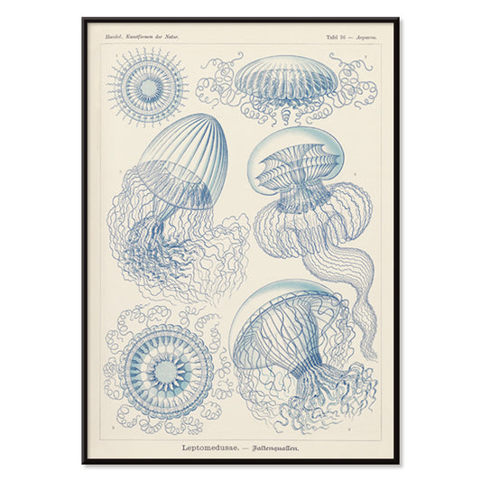
Leptomedusae Poster
Ernst Haeckel · 1862 · Detailed jellyfish scientific print with floating bells and fine blue linework
Plakat od 40,50 zł · W ramce od 72 zł
Cena regularna Od 27,00 złCena regularna -
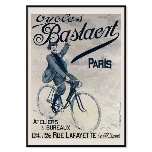
Cycles Bastaent Paris Poster
Charles Tichon · 1895 · Energetic cycling poster with bold Belle Epoque lettering and vivid blue atmosphere
Plakat od 40,50 zł · W ramce od 72 zł
Cena regularna Od 27,00 złCena regularna -
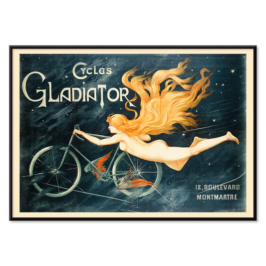
Cycles Gladiator Poster
C.B. · 1895 · Daring Art Nouveau bicycle poster featuring a triumphant rider and bold Cycles Gladiator lettering
Plakat od 40,50 zł · W ramce od 72 zł
Cena regularna Od 27,00 złCena regularna -
Mt. Fuji from Satta Poster
Kobayashi Kiyochika · 1881 · Serene Japanese landscape poster featuring Mt Fuji above a winding coastal road and blue sea
Plakat od 40,50 zł · W ramce od 72 zł
Cena regularna Od 27,00 złCena regularna -
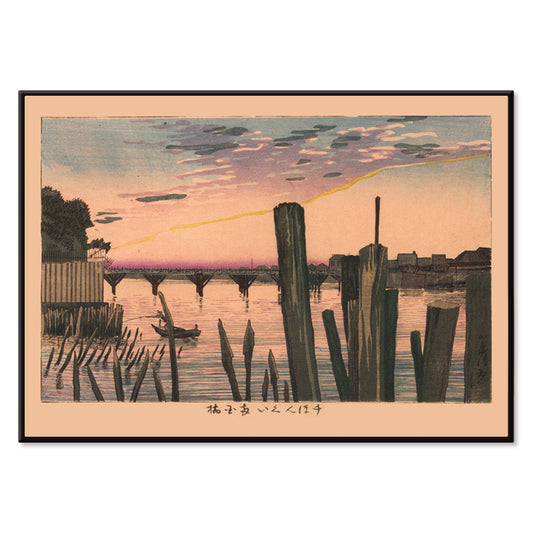
Breakwater Stakes and Ryōgoku Bridge Poster
Kobayashi Kiyochika · 1881 · Serene river art print with Ryōgoku Bridge and breakwater stakes at dusk
Plakat od 40,50 zł · W ramce od 72 zł
Cena regularna Od 27,00 złCena regularna -
Rudge Poster
Jean de Paleologue · 1898 · Art Nouveau bicycle poster with winged muse lifting a gleaming cycle above crowds
Plakat od 40,50 zł · W ramce od 72 zł
Cena regularna Od 27,00 złCena regularna -
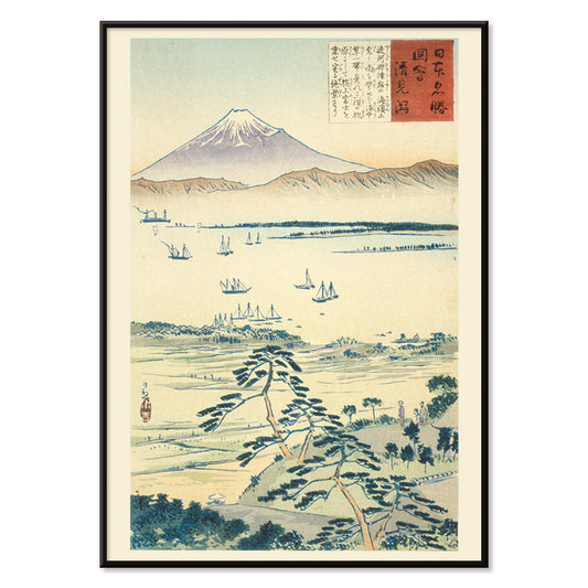
View of Fuji from the Coast of Kiyomigata Poster
Kobayashi Kiyochika · 1896 · Quiet coastal poster with Mount Fuji beyond sailboats and misty blue water
Plakat od 40,50 zł · W ramce od 72 zł
Cena regularna Od 27,00 złCena regularna -
Persimmons and White-Eyes Poster
Kobayashi Kiyochika · 1880 · Poetic bird-and-fruit print with white-eyes perched among ripe persimmons
Plakat od 40,50 zł · W ramce od 72 zł
Cena regularna Od 27,00 złCena regularna -
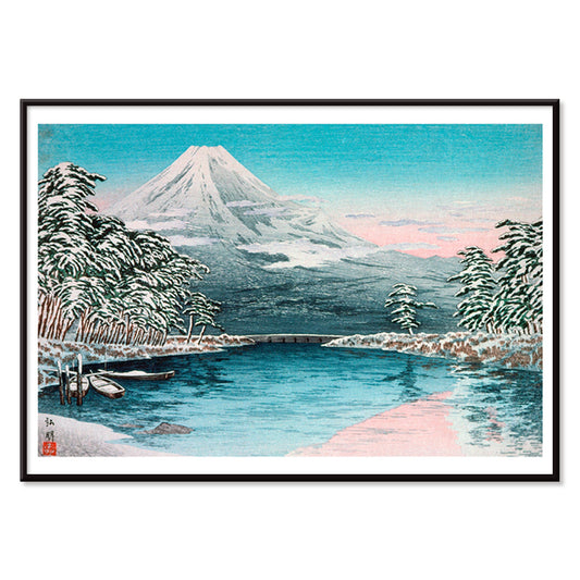
Mt. Fuji from Tagonoura Poster
Takahashi Hiroaki · 1932 · Serene Japanese art print of Mt Fuji mirrored in calm coastal waters
Plakat od 40,50 zł · W ramce od 72 zł
Cena regularna Od 27,00 złCena regularna -
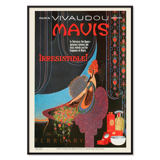
Vivaudous Mavis Poster
Fred L. Parker · 1920 · Glamorous Art Deco perfume poster with elegant figure and jewel toned bottles
Plakat od 40,50 zł · W ramce od 72 zł
Cena regularna Od 27,00 złCena regularna -
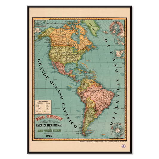
Septentrional and Meridional Poster
Josep Paluzie Lucena · 1899 · Detailed Americas vintage print with crisp labels and calm blue seas
Plakat od 40,50 zł · W ramce od 72 zł
Cena regularna Od 27,00 złCena regularna -
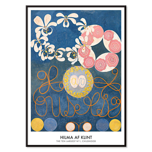
Childhood Group IV Poster
Hilma af Klint · 1907 · Radiant abstract art print with spiraling forms and pastel colors evoking childhood energy
Plakat od 40,50 zł · W ramce od 72 zł
Cena regularna Od 27,00 złCena regularna -
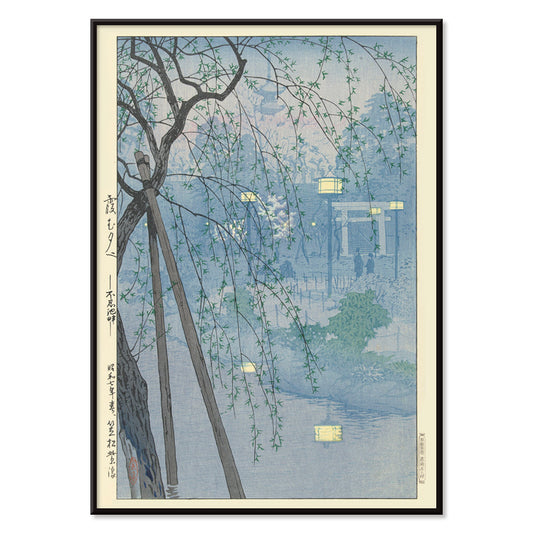
The edge of the Shinobazu Poster
Kasamatsu Shirô · 1932 · Serene Shinobazu Pond art print with misty water and willow silhouettes in blue
Plakat od 40,50 zł · W ramce od 72 zł
Cena regularna Od 27,00 złCena regularna -
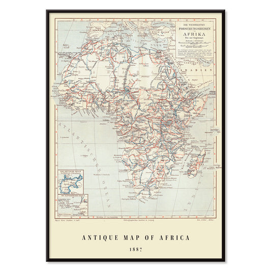
Antique map of Africa Poster
Institute of Liepzig · 1851 · Detailed Africa vintage print with gridded coordinates and dense place names
Plakat od 40,50 zł · W ramce od 72 zł
Cena regularna Od 27,00 złCena regularna -
Antique map of Scandinavia Poster
Institute of Liepzig · 1867 · Detailed Scandinavia vintage print with pastel regions, blue seas, and dense cartographic labeling
Plakat od 40,50 zł · W ramce od 72 zł
Cena regularna Od 27,00 złCena regularna -
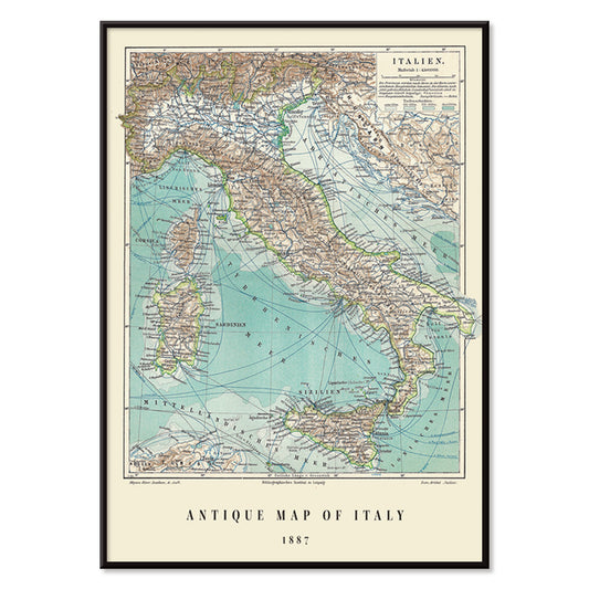
Antique map of Italy Poster
Institute of Liepzig · 1887 · Classic Italy map poster with crisp borders, islands, and dense geographic labeling
Plakat od 40,50 zł · W ramce od 72 zł
Cena regularna Od 27,00 złCena regularna -
Mapamundi Poster
Josep Paluzie Lucena · 1900 · Detailed vintage world map poster with blue oceans and warm beige paper
Plakat od 40,50 zł · W ramce od 72 zł
Cena regularna Od 27,00 złCena regularna -
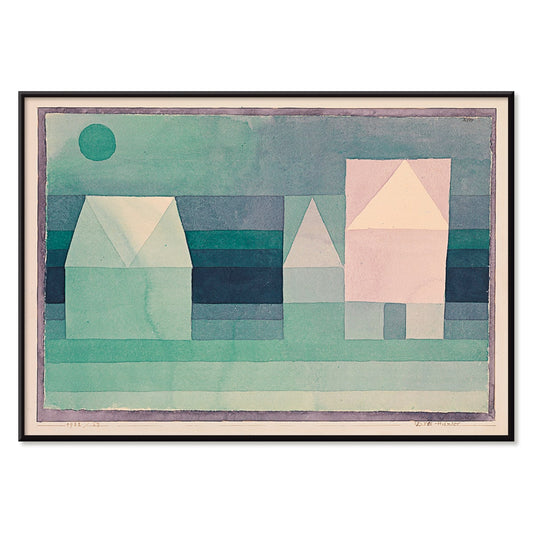
Three Houses Poster
Paul Klee · 1922 · Geometric village art print with three stylized houses in soft green, blue, and pink
Plakat od 40,50 zł · W ramce od 72 zł
Cena regularna Od 27,00 złCena regularna -
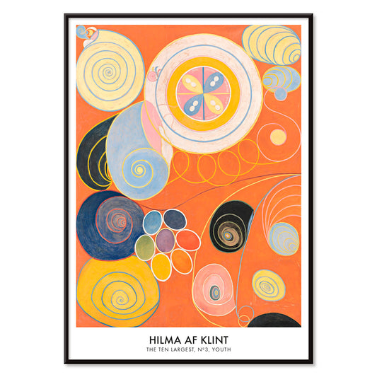
The Ten Largest No. 3 Poster
Hilma af Klint · 1907 · Radiant abstract art print with spirals, petal forms, and floating symbols on orange
Plakat od 40,50 zł · W ramce od 72 zł
Cena regularna Od 27,00 złCena regularna -
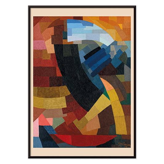
Fragments de figure Poster
Otto Freundlich · 1928 · Vibrant geometric poster of a fragmented figure with bold black outlines
Plakat od 40,50 zł · W ramce od 72 zł
Cena regularna Od 27,00 złCena regularna -
Komposition (1939) Poster
Otto Freundlich · 1939 · Geometric abstract poster featuring earthy browns with blue and yellow accents
Plakat od 40,50 zł · W ramce od 72 zł
Cena regularna Od 27,00 złCena regularna -
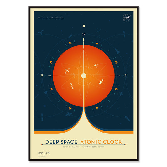
Deep Space Atomic Clock Poster
NASA · 1958 · Bold orange clock poster set against deep blue space in a vintage science style
Plakat od 40,50 zł · W ramce od 72 zł
Cena regularna Od 27,00 złCena regularna -
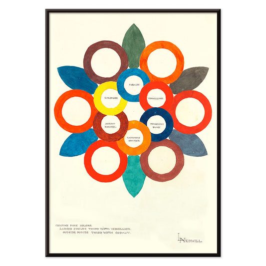
Centre Pure Colors Poster
Elizabeth A. Nedwill · 1900 · Abstract color wheel poster with overlapping rings in warm and cool hues
Plakat od 40,50 zł · W ramce od 72 zł
Cena regularna Od 27,00 złCena regularna -
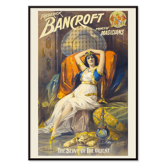
Prince of magicians Poster
Springer and Welty Lith · 1910 · Glamorous stage magic poster featuring reclining enchantress, hookah, and tiger rug
Plakat od 40,50 zł · W ramce od 72 zł
Cena regularna Od 27,00 złCena regularna -
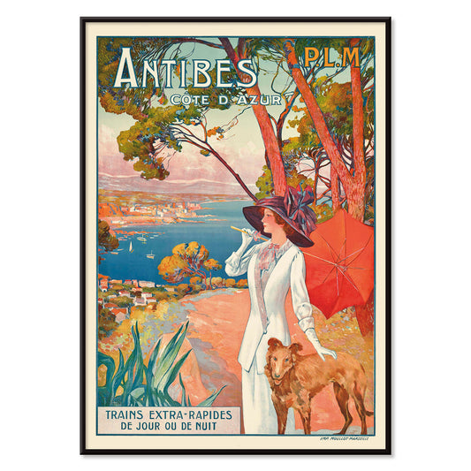
Antibes Poster
David Dellepiane · 1910 · Belle Epoque Antibes poster featuring a stylish woman and dog above the Mediterranean coast
Plakat od 40,50 zł · W ramce od 72 zł
Cena regularna Od 27,00 złCena regularna -
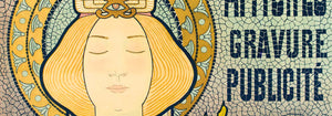
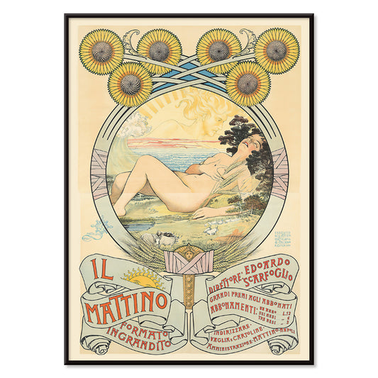
II Mattino Poster
Giovanni Mataloni · 1896 · Lyrical Art Nouveau poster of a reclining woman framed by glowing sunflowers
Plakat od 40,50 zł · W ramce od 72 zł
Cena regularna Od 27,00 złCena regularna -
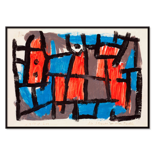
The Hour Before One Night Poster
Paul Klee · 1940 · Dreamlike abstract poster with black lines and red blue shapes on muted ground
Plakat od 40,50 zł · W ramce od 72 zł
Cena regularna Od 27,00 złCena regularna -
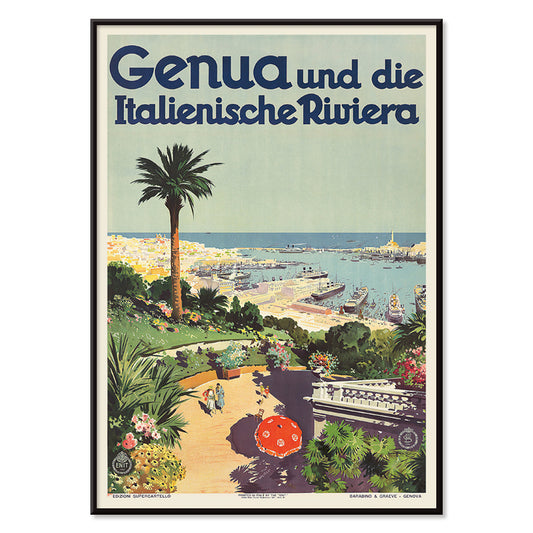
Genua Poster
Aurelio Craffonara · 1931 · Sunlit Genoa harbor poster with stylized boats and crisp coastal city silhouettes
Plakat od 40,50 zł · W ramce od 72 zł
Cena regularna Od 27,00 złCena regularna -
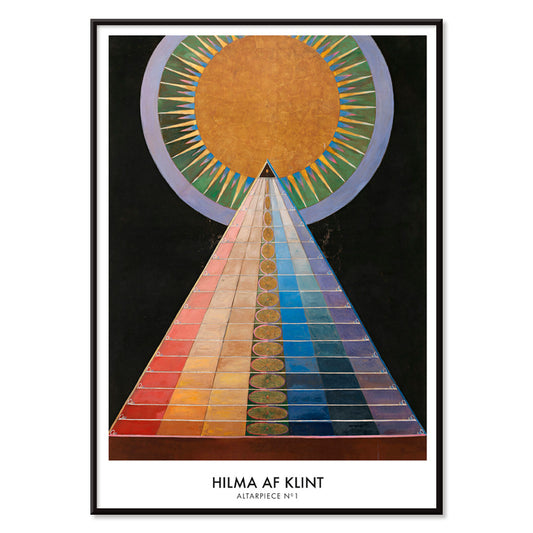
Altarpiece No. 1 Poster
Hilma af Klint · 1915 · Radiant geometric art print featuring a central sun motif and bold shapes on black
Plakat od 40,50 zł · W ramce od 72 zł
Cena regularna Od 27,00 złCena regularna -
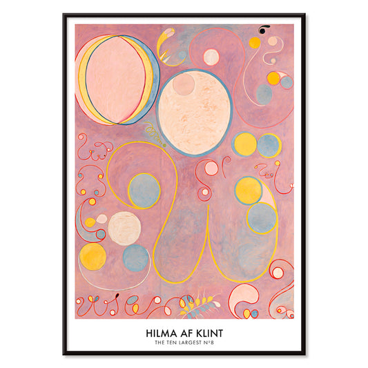
The Ten Largest No. 8 Poster
Hilma af Klint · 1907 · Ethereal abstract art print of spirals and symbolic forms in pink, yellow, and blue
Plakat od 40,50 zł · W ramce od 72 zł
Cena regularna Od 27,00 złCena regularna -
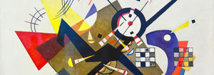
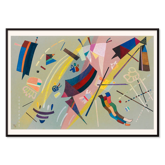
Kandinsky 1941 Poster
Wassily Kandinsky · 1941 · Lyrical abstract poster with floating geometric accents in blue, yellow, pink, and red
Plakat od 40,50 zł · W ramce od 72 zł
Cena regularna Od 27,00 złCena regularna -
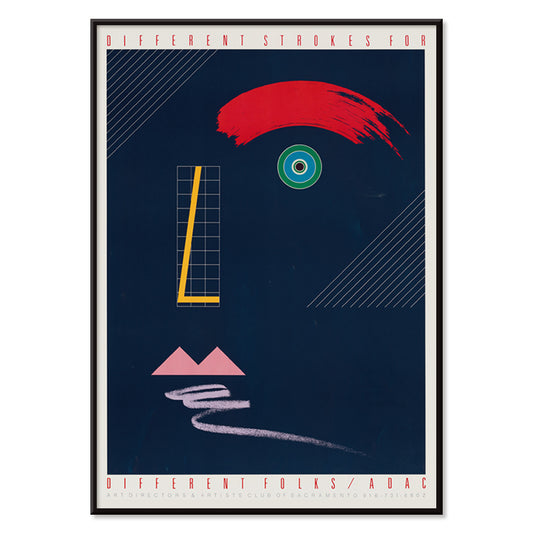
Different strokes for different folks Poster
McRay Magleby · 1942 · Playful geometric poster celebrating individuality with bright mid-century color blocks
Plakat od 40,50 zł · W ramce od 72 zł
Cena regularna Od 27,00 złCena regularna -
Red and Green Gradation Poster
Paul Klee · 1921 · Modernist abstract poster featuring graded red and green blocks with fine black lines
Plakat od 40,50 zł · W ramce od 72 zł
Cena regularna Od 27,00 złCena regularna -
The Seafarer Poster
Paul Klee · 1923 · Playful abstract seafaring poster with rhythmic symbols evoking music and ocean travel
Plakat od 40,50 zł · W ramce od 72 zł
Cena regularna Od 27,00 złCena regularna -
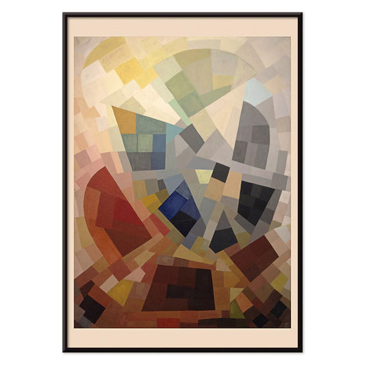
Area Broken by Perpendiculars Poster
Joseph Schillinger · 1934 · Geometric abstract poster featuring perpendicular grids and vivid color blocks in rhythmic balance
Plakat od 40,50 zł · W ramce od 72 zł
Cena regularna Od 27,00 złCena regularna -
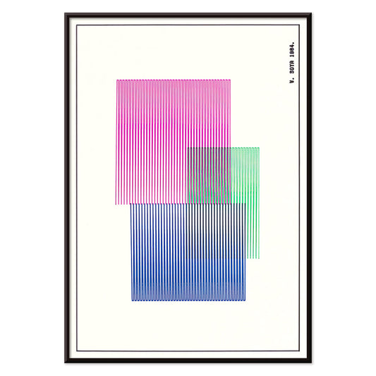
Red, Blue, Green Poster
W. Soya · 1964 · Geometric color-block poster with crisp lines and bright red, blue, green contrasts
Plakat od 40,50 zł · W ramce od 72 zł
Cena regularna Od 27,00 złCena regularna -
Composition Abstraite Poster
Otto Freundlich · 1937 · Vibrant geometric art print of interlocking color blocks outlined in black
Plakat od 40,50 zł · W ramce od 72 zł
Cena regularna Od 27,00 złCena regularna -
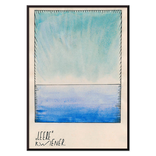
Leere Poster
Karl Wiener · 1921 · Minimalist blue gradient art print that turns empty space into quiet visual depth
Plakat od 40,50 zł · W ramce od 72 zł
Cena regularna Od 27,00 złCena regularna -
Osnovnoye Design Poster
Gustavs Klucis · 1920 · Dynamic Constructivist poster with Cyrillic type and bold red geometric forms
Plakat od 40,50 zł · W ramce od 72 zł
Cena regularna Od 27,00 złCena regularna -
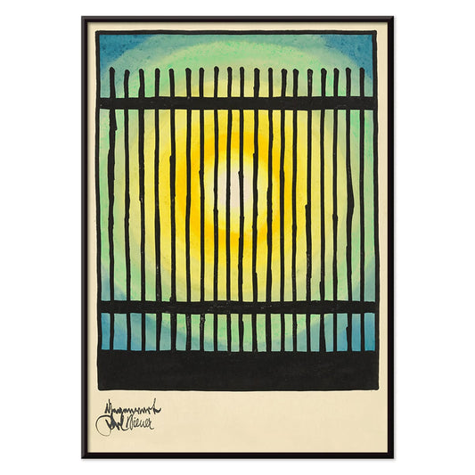
Gegenwart Poster
Karl Wiener · 1923 · Modernist abstract poster featuring a black grid against a glowing sunlit field
Plakat od 40,50 zł · W ramce od 72 zł
Cena regularna Od 27,00 złCena regularna -
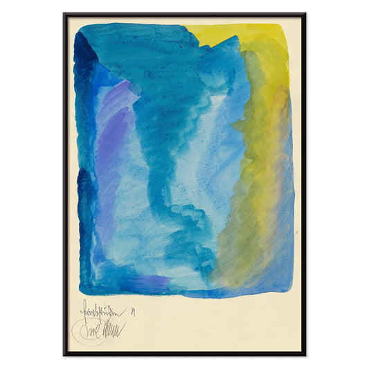
Farbstudien, 10 Blätter IV Poster
Karl Wiener · 1923 · Luminous abstract watercolor art print with layered color fields in blue, purple, and yellow
Plakat od 40,50 zł · W ramce od 72 zł
Cena regularna Od 27,00 złCena regularna


72/867 items
- West Coast of Jutland Poster
- On the beach at Grado Poster
- Swimming Polyps Poster
- Jellyfish Poster
- Blue stars Poster
- Spectral Analysis Poster
- The Earth view from the ISS Poster
- Geikie Plateau Poster
- Soyuz MS-02 spacecraft Poster
- Soyuz TMA-14M spacecraft Poster
- Soyuz MS-02 spacecraft Poster
- CST-100 crew capsule Poster
- Palm Tree, Nassau Poster
- Flower Garden and Bungalow Poster
- Orange Trees And Gate Poster
- Discomedusae Poster
- Leptomedusae Poster
- Cycles Gladiator Poster
- Rudge Poster
- View of Fuji from the Coast of Kiyomigata Poster
- Vivaudous Mavis Poster
- Childhood Group IV Poster
- Mapamundi Poster
- The Ten Largest No. 3 Poster
- Fragments de figure Poster
- Deep Space Atomic Clock Poster
- Centre Pure Colors Poster
- Antibes Poster
- Genua Poster
- Altarpiece No. 1 Poster
- The Ten Largest No. 8 Poster
- Kandinsky 1941 Poster
- Different strokes for different folks Poster
- Area Broken by Perpendiculars Poster
- Red, Blue, Green Poster
- Farbstudien, 10 Blätter IV Poster
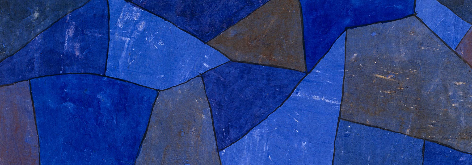
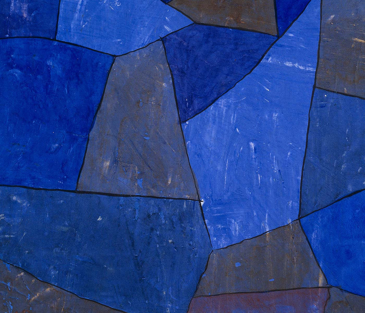
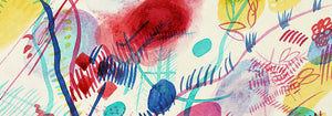
Blue as atmosphere, not just a hue
Blue rarely behaves like a single color. In vintage poster design it becomes distance, weather, depth, and even time, shifting from Prussian ink to pale sky wash as the subject changes. This collection treats blue as a structural element in wall art decoration: it can cool a room, clarify a line, and make paper feel archival. You see it in coastal imagery, in diagrammatic plates, and in graphic compositions where the blue field is the main event rather than a background. For adjacent moods, the pared-back restraint of Minimalist posters and the tonal focus of Black & White prints offer clean counterpoints.
Indigo, cyanotype, and the modernist sky
Historically, blue arrives through different technologies as much as through taste. Textile indigo moved between craft and industry, while cyanotype made photographic images from chemistry and sunlight, producing that unmistakable blueprint blue. William Morris’s Strawberry Thief (1883) sets rich indigo behind fruit and birds, turning repetition into a kind of domestic architecture that reads as both pattern and pictorial scene. Anna Atkins’s Fern (1850) cyanotype shows how the same color can act as evidence: the plant appears as a precise silhouette, halfway between specimen and lacework. In modern abstraction, Wassily Kandinsky’s Bleu de Ciel (1925) uses blue as a stage for floating signs, linking painting to the era’s fascination with music, science, and mapping the unseen. Related worlds of form and color sit in Abstract and Bauhaus.
Placing blue wall art in a home palette
In home decor, blue is easiest to live with when it is anchored by materials. Warm woods and sandy neutrals keep deep blues from feeling cold, while brushed steel and glass make pale blues feel deliberate rather than decorative. In an entryway, a blue print can act like a visual compass; in a bedroom, it reads as quieter when echoed in linen or a rug. For kitchens, blue beside white tile tends to feel crisp, especially when the imagery is botanical or cartographic. If you want recognizable subjects with blue emphasis, look toward Maps, Sea & Ocean, and Botanical; if the room already has strong color, a simpler sheet from Classic Art can keep the balance.
Curating: rhythm, scale, and framing choices
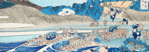
Blue makes curating easier because it can unify mixed imagery across a gallery wall. Start with one dominant piece, then add one or two quieter companions that repeat its temperature without copying its subject. Hokusai’s The Great Wave off Kanagawa (1830) is an obvious anchor: the wave’s blue is not atmospheric but architectural, built from carved contour and foam, almost like typography. Pair it with Kawase Hasui’s Morning at Cape Inubō (1931), where the sea is reduced to bands and gradients, creating a calmer cadence. To keep the set from becoming too nautical, insert a map plate or an abstract composition as a visual pause. Framing finishes also steer the mood: light oak keeps blues breathable, a white mat gives dark inks air, and a slim black frame heightens contrast; options live in Frames.
Blue as ink, dye, pigment, and data
What holds these posters together is not a single era or subject but the way blue carries information. It can read as craft dye, printing ink, mineral pigment, or scientific notation, which is why it fits rooms that mix ceramics, books, and travel objects without looking staged. As vintage wall art, blue often suggests both the sea and the library: a color associated with horizons and with study. That tension between sensation and structure is the collection’s real thread, and it is what makes blue feel steady in everyday decoration.