


- Zniszcz tę szaloną bestię Plakat
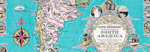
- Dobry sąsiad Ameryki Południowej Plakat
- Włochy i Watykan Plakat
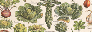
- Cebule Plakat
- Bec-Kina Plakat
- Kohler Chocolat Plakat
- Złodziej truskawek Plakat
- Plakat wystawowy Toma Krojera Plakat
- Wystawa Ernsta Kirchnera Plakat
- El Comienzo Plakat
- Parler Seul 2 Plakat
- Pierścień zmierzchu Plakat
- Parler Seul Plakat
- Faun i nimfa Plakat
- Sen Plakat
- Le Concert Plakat
- Ptak przelatujący przez chmurę Plakat
- Artystka Plakat
- Revenge of the Pink Panther Plakat
- Kobieta i ptak nocą Plakat
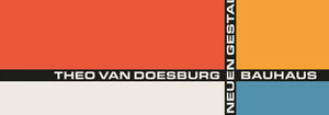
- Bauhaus 20 Plakat
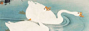
- Niebieski japoński żuraw Plakat
- Snoopy Come Home Plakat
- To London by Jet Clipper Plakat
- Kyushu-Okinawa Plakat
- Xerez Pedro Domecq Plakat
- Balsam Aperitif Plakat
- Masło Plakat
- Crans Plakat
- Monte Carlo Plakat
- Piwo i papieros Plakat
- Zachodnie wybrzeże Meksyku Plakat
- Rita Gaufres Plakat
- Hibiskus Plakat
-
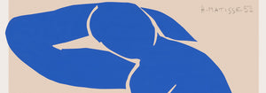
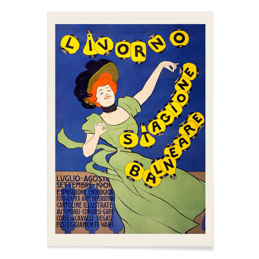
Livorno stagione balneare Poster
Leonetto Cappiello · 1901 · Spirited seaside poster with a green figure and glowing lanterns against deep night
Plakat od 40,50 zł · W ramce od 72 zł
Cena regularna Od 27,00 złCena regularna -
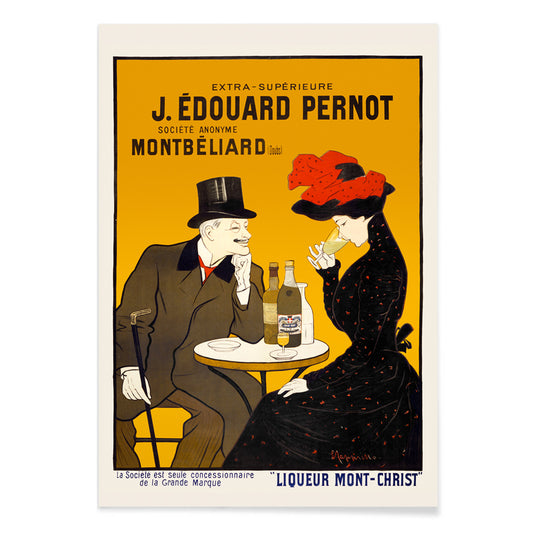
Man and woman at a cafe Poster
Leonetto Cappiello · 1900 · Chic café couple poster with bold black contrast and warm yellow red highlights
Plakat od 40,50 zł · W ramce od 72 zł
Cena regularna Od 27,00 złCena regularna -
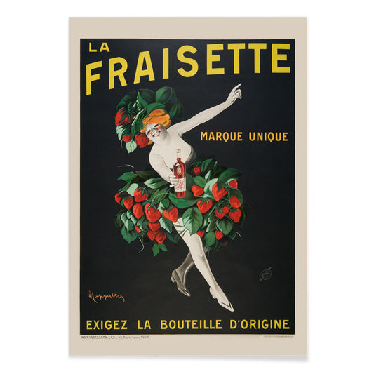
The Fraisette Poster
Leonetto Cappiello · 1909 · Playful strawberry-costumed figure poster glowing against deep black with vivid green leaves
Plakat od 40,50 zł · W ramce od 72 zł
Cena regularna Od 27,00 złCena regularna -
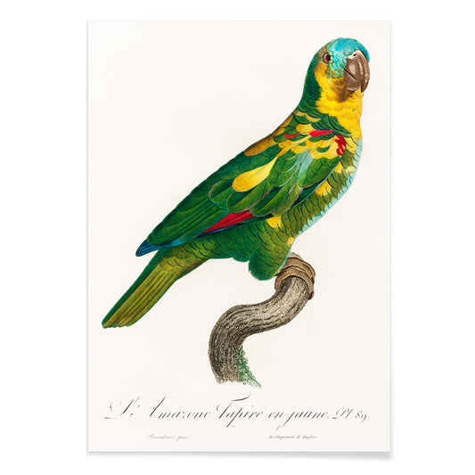
The Turquoise-Fronted Amazon Poster
Francois Levaillant · 1803 · Detailed parrot print with turquoise forehead accents and richly layered green plumage
Plakat od 40,50 zł · W ramce od 72 zł
Cena regularna Od 27,00 złCena regularna -
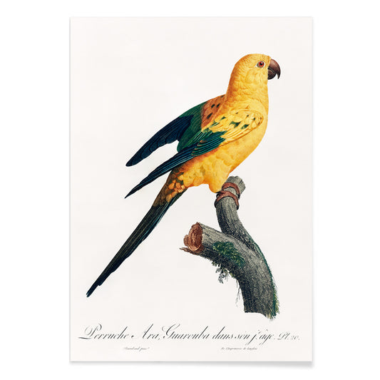
The Sun Parakeet Poster
Francois Levaillant · 1803 · Radiant sun parakeet print perched on a branch with crisp naturalist detail
Plakat od 40,50 zł · W ramce od 72 zł
Cena regularna Od 27,00 złCena regularna -
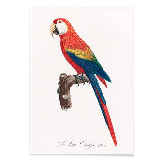
Ara Canga Poster
Francois Levaillant · 1803 · Vivid Ara Canga parrot print with scarlet plumage, blue wings, and yellow accents
Plakat od 40,50 zł · W ramce od 72 zł
Cena regularna Od 27,00 złCena regularna -
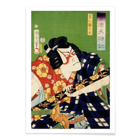
Portraits of an Actor in costume Poster
Toyohara Kunichika · 1870 · Dramatic kabuki actor print with bold costume patterns and intense gaze
Plakat od 40,50 zł · W ramce od 72 zł
Cena regularna Od 27,00 złCena regularna -
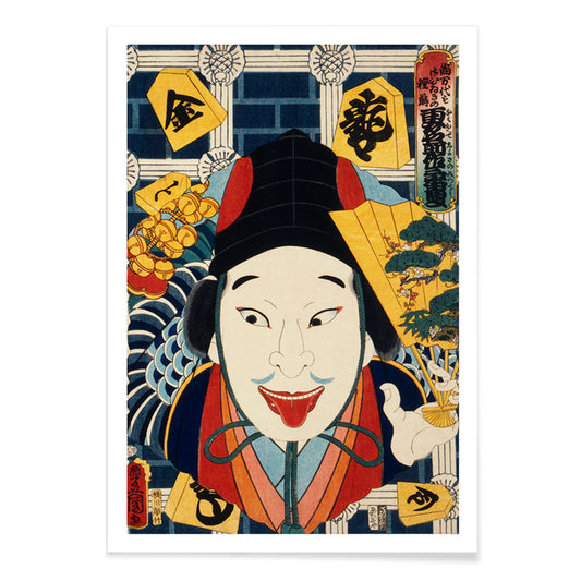
Portraits of an Actor Poster
Toyohara Kunichika · 1868 · Dramatic kabuki actor poster with bold makeup, patterned robe, and vivid color blocks
Plakat od 40,50 zł · W ramce od 72 zł
Cena regularna Od 27,00 złCena regularna -
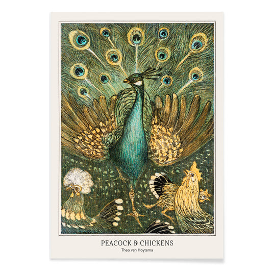
Peacock & Chickens Poster
Theo van Hoytema · 1878 · Elegant animal print featuring a vibrant peacock among calm chickens in a farmyard setting
Plakat od 40,50 zł · W ramce od 72 zł
Cena regularna Od 27,00 złCena regularna -
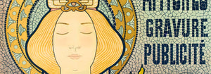
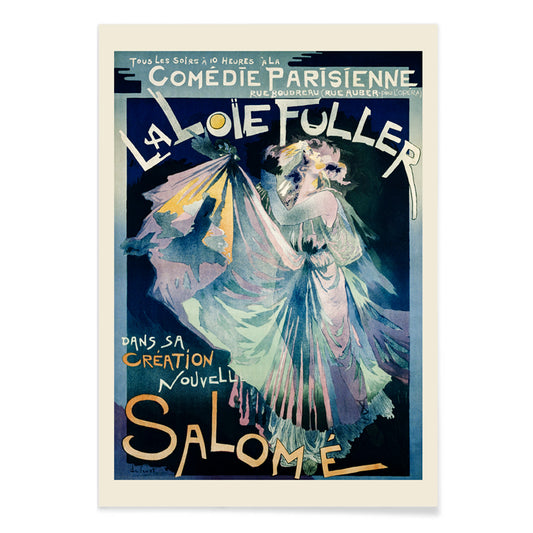
Comédie–Parisienne Poster
Georges de Feure · 1895 · Art Nouveau Loie Fuller poster with swirling stage drapery and luminous blue tones
Plakat od 40,50 zł · W ramce od 72 zł
Cena regularna Od 27,00 złCena regularna -
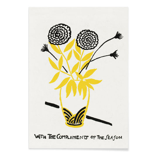
With the Compliments of the Season Poster
Henry Lyman Sayen · 1875 · Seasonal floral poster pairing bold lettering with a bright bouquet on dark ground
Plakat od 40,50 zł · W ramce od 72 zł
Cena regularna Od 27,00 złCena regularna -
Wey Poster
William Morris · 1882 · Arts and Crafts floral print in cool blue tones with lively botanical rhythm
Plakat od 40,50 zł · W ramce od 72 zł
Cena regularna Od 27,00 złCena regularna -
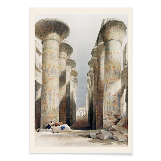
Great Hall at Karnak temple Poster
David Roberts · 1849 · Majestic Karnak temple poster with soaring columns and sunlit visitors in the ancient hall
Plakat od 40,50 zł · W ramce od 72 zł
Cena regularna Od 27,00 złCena regularna -
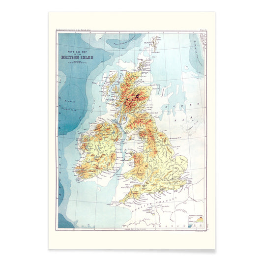
Gazetteer of the British Isles Poster
John Bartholomew · 1887 · Detailed British Isles vintage print balancing crisp labels with an atlas-like cartographic layout
Plakat od 40,50 zł · W ramce od 72 zł
Cena regularna Od 27,00 złCena regularna -
Up-to-date map of the world war Poster
Manila Shinbun-sha · 1942 · Detailed world war map poster with color coded routes and lively hand drawn icons
Plakat od 40,50 zł · W ramce od 72 zł
Cena regularna Od 27,00 złCena regularna -
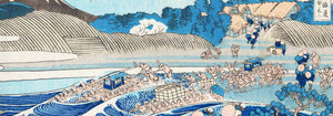
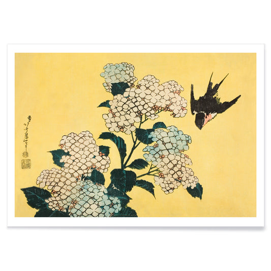
Hydrangea and Swallow Poster
Katsushika Hokusai · 1833 · Airy swallow and hydrangea print balancing crisp linework with calm summer light
Plakat od 40,50 zł · W ramce od 72 zł
Cena regularna Od 27,00 złCena regularna -
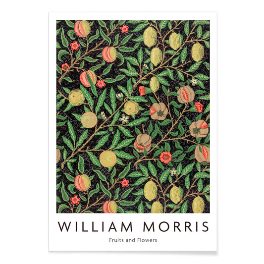
Fruit pattern Poster
William Morris · 1862 · Lush fruit and leaf pattern print with rhythmic vines on a deep ground
Plakat od 40,50 zł · W ramce od 72 zł
Cena regularna Od 27,00 złCena regularna -
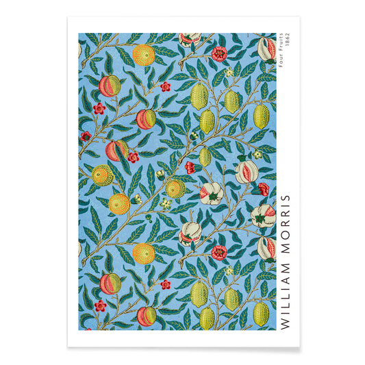
Four fruits pattern Poster
William Morris · 1862 · Lush fruit and foliage poster featuring interlacing leaves and rich blue backgrounds
Plakat od 40,50 zł · W ramce od 72 zł
Cena regularna Od 27,00 złCena regularna -
Water Serpents II Poster
Gustav Klimt · 1907 · Sensual Art Nouveau art print of water nymphs entwined in gold, violet, and coral
Plakat od 40,50 zł · W ramce od 72 zł
Cena regularna Od 27,00 złCena regularna -
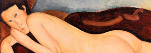
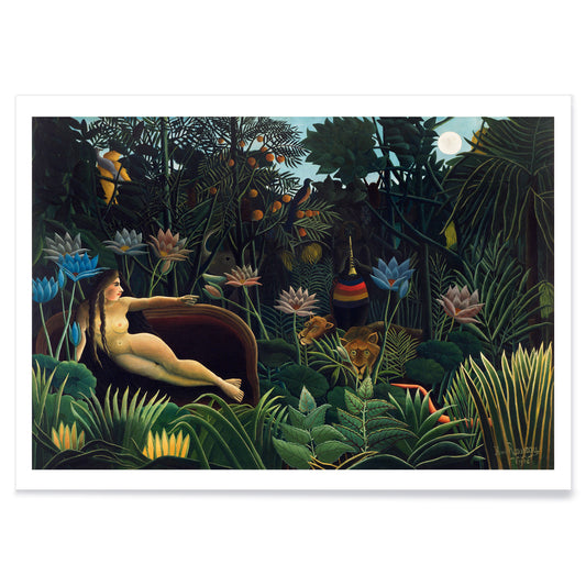
The Dream Poster
Henri Rousseau · 1910 · Dreamlike jungle poster with reclining figure, moonlit foliage, and quietly watchful animals
Plakat od 40,50 zł · W ramce od 72 zł
Cena regularna Od 27,00 złCena regularna -
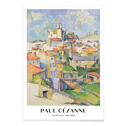
Gardanne Poster
Paul Cézanne · 1886 · Structured Provençal village art print with terracotta roofs and cool blue sky
Plakat od 40,50 zł · W ramce od 72 zł
Cena regularna Od 27,00 złCena regularna -
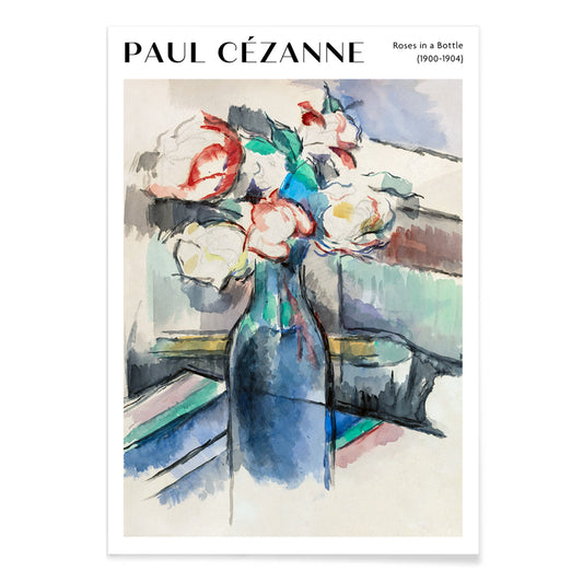
Roses in a Bottle Poster
Paul Cézanne · 1902 · Luminous roses art print arranged in a bottle with soft blue and green tones
Plakat od 40,50 zł · W ramce od 72 zł
Cena regularna Od 27,00 złCena regularna -
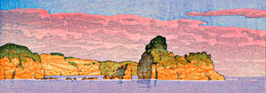
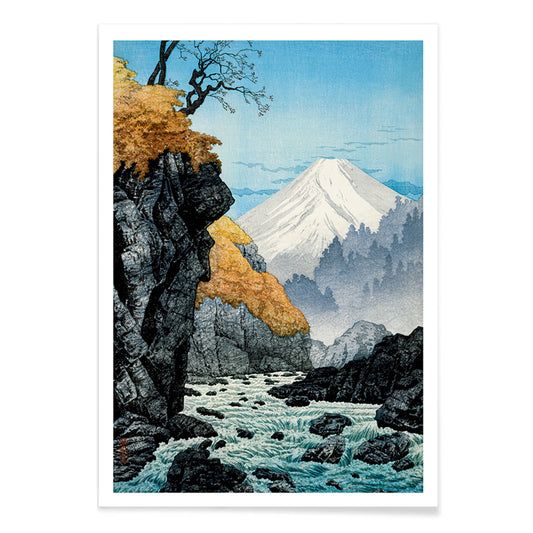
Foot of Mount Ashitaka Poster
Hiroaki Takahashi · 1932 · Serene river landscape poster with golden trees and distant blue mountain
Plakat od 40,50 zł · W ramce od 72 zł
Cena regularna Od 27,00 złCena regularna -
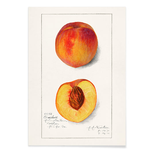
Prunus Persica Poster
Amanda Almira Newton · 1911 · Delicate peach botanical print with ripening fruit and soft leaves on white ground
Plakat od 40,50 zł · W ramce od 72 zł
Cena regularna Od 27,00 złCena regularna -
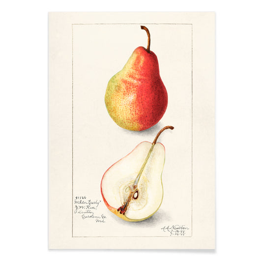
Pyrus Communis Poster
Bertha Heiges · 1904 · Refined botanical print of ripe pears and green leaves on a white background
Plakat od 40,50 zł · W ramce od 72 zł
Cena regularna Od 27,00 złCena regularna -
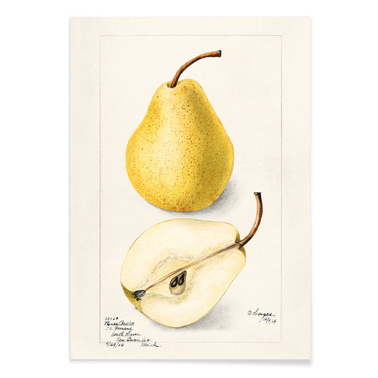
Pyrus Communis 2 Poster
Amanda Almira Newton · 1908 · Delicate pear botanical print with warm yellow skin, red blush, and crisp leaves
Plakat od 40,50 zł · W ramce od 72 zł
Cena regularna Od 27,00 złCena regularna -
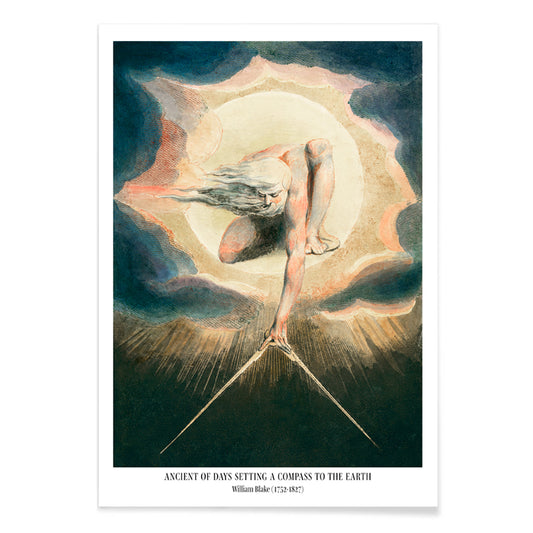
Compass to the Earth Poster
William Blake · 1794 · Visionary Urizen poster with blazing sun disc and compass over midnight blue
Plakat od 40,50 zł · W ramce od 72 zł
Cena regularna Od 27,00 złCena regularna -
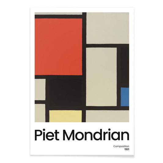
Composition with Large Red Plane Poster
Pieter Cornelis Mondriaan · 1921 · Geometric abstract art print with a large red plane and crisp black grid
Plakat od 40,50 zł · W ramce od 72 zł
Cena regularna Od 27,00 złCena regularna -
Composition with Large Blue Plane Poster
Pieter Cornelis Mondriaan · 1921 · Geometric De Stijl art print with a large blue plane and crisp black lines
Plakat od 40,50 zł · W ramce od 72 zł
Cena regularna Od 27,00 złCena regularna -
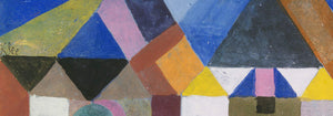
Composition A Poster
Pieter Cornelis Mondriaan · 1920 · Geometric abstract art print with black grid and primary color blocks on white
Plakat od 40,50 zł · W ramce od 72 zł
Cena regularna Od 27,00 złCena regularna -
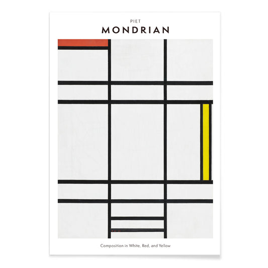
Composition in White, Red, and Yellow Poster
Pieter Cornelis Mondriaan · 1936 · Geometric art print balancing white space with crisp black lines and primary blocks
Plakat od 40,50 zł · W ramce od 72 zł
Cena regularna Od 27,00 złCena regularna -
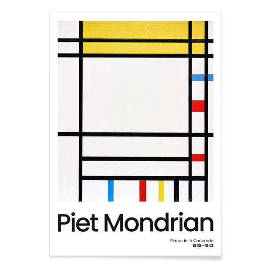
Place de la Concorde Poster
Piet Mondrian · 1941 · Geometric abstract poster balancing a black grid with red, yellow, and blue planes
Plakat od 40,50 zł · W ramce od 72 zł
Cena regularna Od 27,00 złCena regularna -
Senecio Poster
Paul Klee · 1922 · Mask-like geometric poster with warm orange and yellow blocks and steady eyes
Plakat od 40,50 zł · W ramce od 72 zł
Cena regularna Od 27,00 złCena regularna -
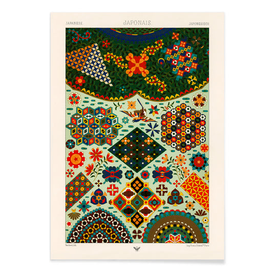
Japanese pattern Poster
Albert-Charles-Auguste Racinet · 1888 · Vibrant Japanese pattern poster of interlaced florals and geometry in rich color
Plakat od 40,50 zł · W ramce od 72 zł
Cena regularna Od 27,00 złCena regularna -
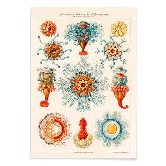
Vintage jellyfish illustration Poster
Ernst Haeckel · 1904 · Detailed jellyfish scientific print with floating bells, frilled edges, and trailing tentacles
Plakat od 40,50 zł · W ramce od 72 zł
Cena regularna Od 27,00 złCena regularna -
Kirche in Cassone Poster
Gustav Klimt · 1913 · Luminous lakeside church art print with shimmering reflections and mosaic-like color blocks
Plakat od 40,50 zł · W ramce od 72 zł
Cena regularna Od 27,00 złCena regularna


36/706 items
- The Sun Parakeet Poster
- Ara Canga Poster
- Portraits of an Actor in costume Poster
- Portraits of an Actor Poster
- Fruit pattern Poster
- Four fruits pattern Poster
- The Dream Poster
- Foot of Mount Ashitaka Poster
- Prunus Persica Poster
- Composition with Large Red Plane Poster
- Composition in White, Red, and Yellow Poster
- Place de la Concorde Poster
A Yellow Thread Through Art History
This collection is not about monochrome. It follows the way yellow behaves when it enters an image: as light, as warning, as ornament, as a quick lift of energy. In vintage poster culture it grabs attention from the street; in modern painting it becomes structure; in natural history it suggests pollen, rind, and sun-aged paper. Read these posters and prints as a vocabulary of warmth, from buttery highlights to sharp, electric notes that alter the temperature of wall art.
Gold, Citrus, and the Logic of Color
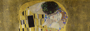
Few works show yellow as both luxury and technique as clearly as Gustav Klimt’s The Kiss (1907–1908), where metallic yellows behave like tesserae, turning paint into surface and surface into symbolism. At the opposite pole, Michel Eugène Chevreul’s Cercle chromatique treats hue as measurable information, a scientific diagram that still reads as decorative design. Together they explain why yellow persists across eras: it can signal opulence, illumination, or method, making a vintage art print feel both immediate and intellectually grounded.
Using Yellow Accents in Interior Decoration
In home decor, yellow works best when it has a job. A narrow hallway benefits from a small flare near a mirror; a kitchen welcomes yellows that feel citrus or grain-like; a study can take sharper, more analytic tones. Pair yellow posters with chalky whites, walnut, and linen for quiet warmth, or set them against deep greens and inky blues for contrast. For restraint and geometry, move between Minimalist and Abstract; for natural counterpoints, Botanical keeps the color tethered to stems, seed heads, and scientific observation.
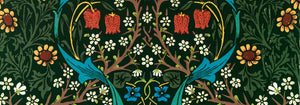
Curating a Gallery Wall with Pattern and Structure
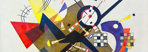
When building a gallery wall, think in rhythms: pattern, grid, then a single vivid note. William Morris’s Strawberry Thief (1883) brings textile density and a garden logic that softens modern furniture. Balance it with Piet Mondrian’s Composition in White, Red, and Yellow (1936), where yellow becomes a measured plane rather than atmosphere. Add controlled dynamism through Wassily Kandinsky’s Circles in a circle, Bauhaus exhibition (1923), a bridge between exhibition poster design and painting. To extend the mix, Advertising supports bolder typography, Bauhaus tightens the formal language, and Classic Art introduces quieter tonal anchors.
Why Yellow Feels So Present
Yellow is often dismissed as mere decoration, yet it is frequently a compositional strategy: guiding the eye, implying sunlight, or mapping a system. Hung with intention, a small yellow passage can make surrounding colors read cleaner or deeper, as if the room’s light has been adjusted without touching the lamps.