


- Zniszcz tę szaloną bestię Plakat
- Shaw albo ironia Plakat
- Les Lalanne Plakat
- Punch Boutique Plakat
- Perspektywa judaizmu i pogaństwa Plakat
- Jet Clipper na Hawaje Plakat
- Campari Soda Plakat
- Bec-Kina Plakat
- Berlin Street Scene Plakat
- Wystawa Ernsta Kirchnera Plakat
- Tour Eiffel 2 Plakat
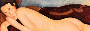
- Siedząca kobieta od tyłu Plakat
- Park Near Lu Plakat
- El Comienzo Plakat
- Parler Seul 2 Plakat
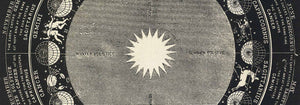
- Obecny punkt widzenia mahatmów Plakat
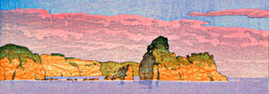
- Pierścień zmierzchu Plakat
- Parler Seul Plakat
- Sen Plakat
- Le Concert Plakat
- Ptak przelatujący przez chmurę Plakat
- Artystka Plakat
- Revenge of the Pink Panther Plakat
- Kobieta i ptak nocą Plakat
- Blaze Plakat
- Almanaque Plakat
- Bauhaus 20 Plakat
- Bauhaus 21 Plakat
- Jedz więcej owoców Plakat
- Niebieski japoński żuraw Plakat
- Snoopy Come Home Plakat
- To London by Jet Clipper Plakat
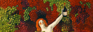
- La Paresse Plakat
- Xerez Pedro Domecq Plakat
- Balsam Aperitif Plakat
- Crans Plakat
-
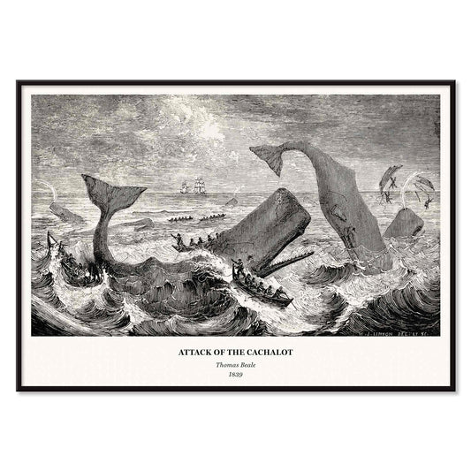
Attack Of the Cachalot Poster
Thomas Beale · 1839 · Dramatic maritime vintage print of a cachalot attack with stark black-and-grey contrast
Plakat od 40,50 zł · W ramce od 72 zł
Cena regularna Od 27,00 złCena regularna -
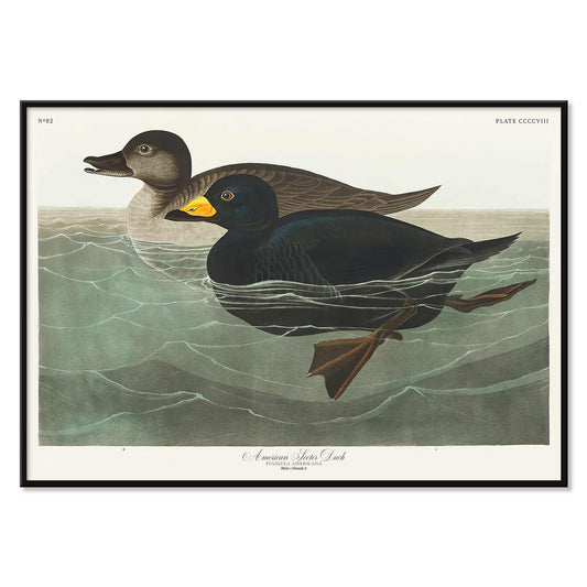
American Scoter Duck Poster
John James Audubon · 1827 · Striking sea duck print with glossy black plumage and a yellow bill
Plakat od 40,50 zł · W ramce od 72 zł
Cena regularna Od 27,00 złCena regularna -
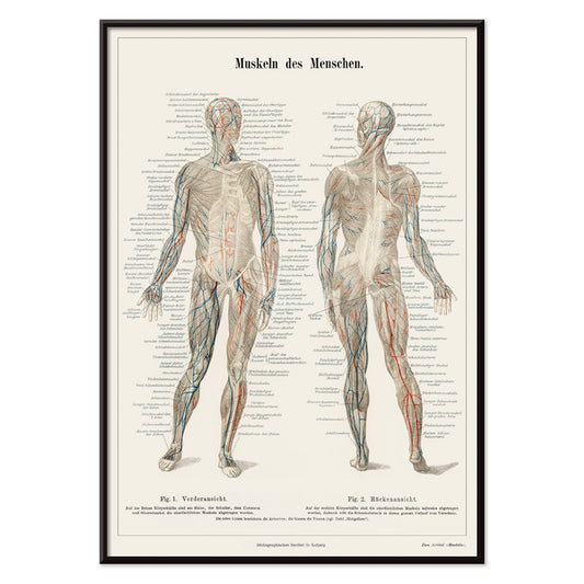
Human Musculature Poster
Unknown artist · 1894 · Detailed human anatomy scientific print showing musculature studies on warm beige paper
Plakat od 40,50 zł · W ramce od 72 zł
Cena regularna Od 27,00 złCena regularna -
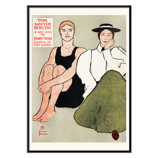
Two seated women Poster
Edward Penfield · 1896 · Elegant vintage poster of two seated women with bold outlines and muted tones
Plakat od 40,50 zł · W ramce od 72 zł
Cena regularna Od 27,00 złCena regularna -
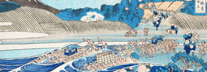
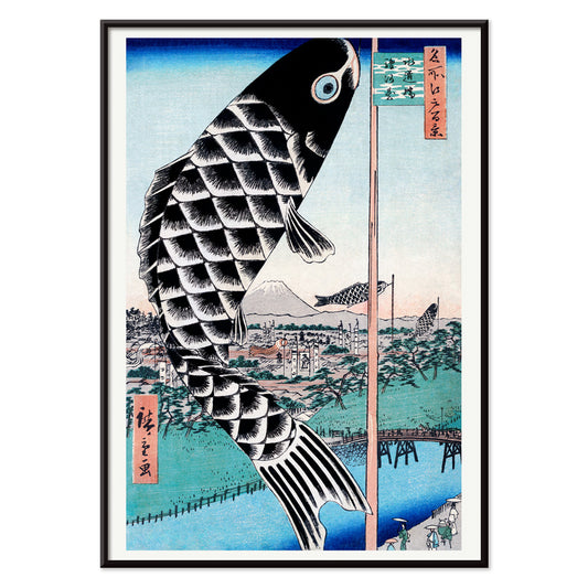
Suidobashi Bridge and Surugadai Poster
Utagawa Hiroshige · 1857 · Airy Edo riverside vintage print featuring a carp windsock above Suidobashi Bridge
Plakat od 40,50 zł · W ramce od 72 zł
Cena regularna Od 27,00 złCena regularna -
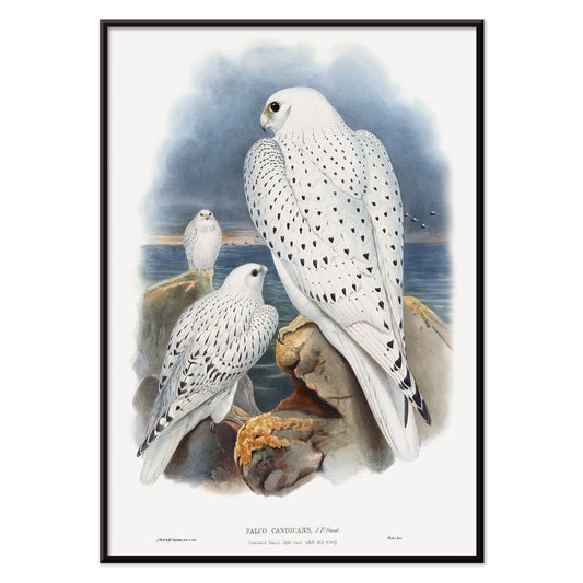
Greenland Falcon Poster
John Gould · 1862 · Detailed falcon print showing three white birds above a stormy northern coast
Plakat od 40,50 zł · W ramce od 72 zł
Cena regularna Od 27,00 złCena regularna -
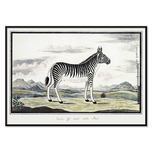
Mountain Zebra Poster
Robert Jacob Gordon · 1786 · Natural history zebra print in crisp linework with calm, open background
Plakat od 40,50 zł · W ramce od 72 zł
Cena regularna Od 27,00 złCena regularna -
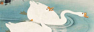
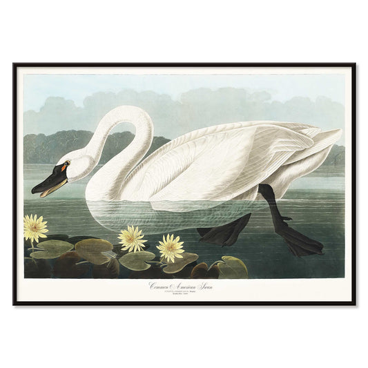
American Swan Poster
John James Audubon · 1827 · Graceful swan print gliding among water lilies with crisp natural history detail
Plakat od 40,50 zł · W ramce od 72 zł
Cena regularna Od 27,00 złCena regularna -
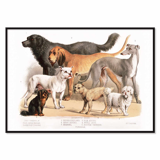
Family Dogs Poster
Unknown artist · 1874 · Victorian family dogs print arranged as a natural history plate in gentle neutral tones
Plakat od 40,50 zł · W ramce od 72 zł
Cena regularna Od 27,00 złCena regularna -
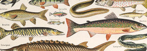
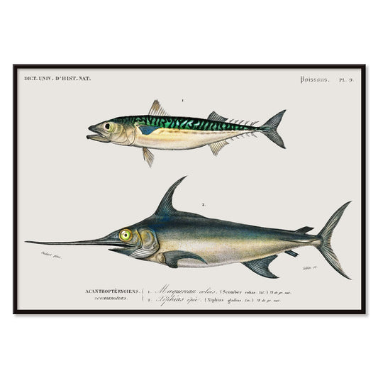
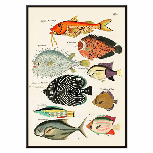
Different types of fishes Poster
Charles Dessalines d Orbigny · 1868 · Detailed fish scientific print featuring varied specimens in blue green and yellow washes
Plakat od 40,50 zł · W ramce od 72 zł
Cena regularna Od 27,00 złCena regularna -
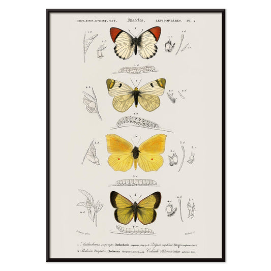
Different types of butterfly Poster
Charles Dessalines D'Orbigny · 1849 · Detailed butterfly scientific print with vibrant yellow, white, and black wings
Plakat od 40,50 zł · W ramce od 72 zł
Cena regularna Od 27,00 złCena regularna -
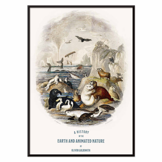
Earth and animated nature Poster
Oliver Goldsmith · 1820 · Detailed animal vintage print arranged as a natural history plate in crisp monochrome
Plakat od 40,50 zł · W ramce od 72 zł
Cena regularna Od 27,00 złCena regularna -
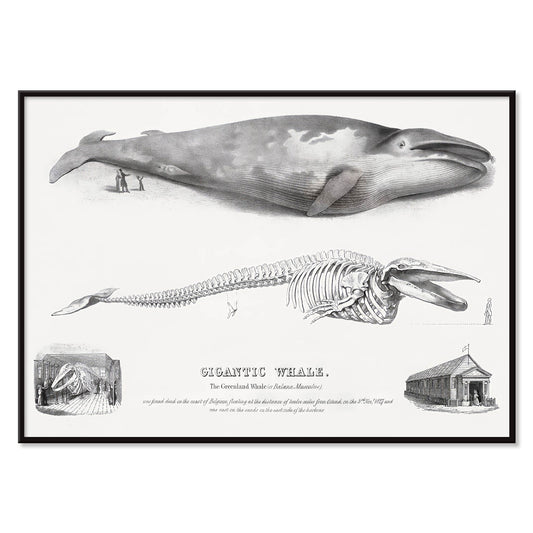
Baloena Musculus Poster
George Johann Scharf · 1758 · Detailed whale and skeleton scientific print rendered with precise linework and archival calm
Plakat od 40,50 zł · W ramce od 72 zł
Cena regularna Od 27,00 złCena regularna -
Fishing Boats Poster
Winslow Homer · 1903 · Sunlit fishing boats art print with turquoise water and crisp white sails
Plakat od 40,50 zł · W ramce od 72 zł
Cena regularna Od 27,00 złCena regularna -
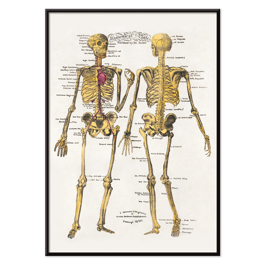
Anatomical plates Poster
Dr. Parker · 1850 · Detailed skeleton scientific print with crisp labels and a warm archival paper tone
Plakat od 40,50 zł · W ramce od 72 zł
Cena regularna Od 27,00 złCena regularna -
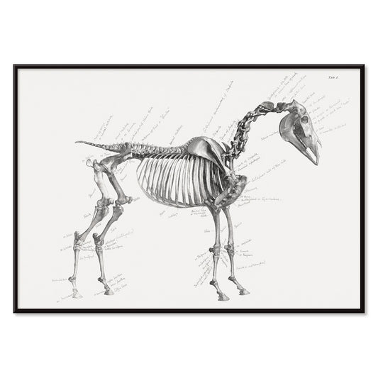
The anatomy of the horse Poster
George Stubbs · 1853 · Striking horse anatomy scientific print in crisp monochrome with labeled studies
Plakat od 40,50 zł · W ramce od 72 zł
Cena regularna Od 27,00 złCena regularna -
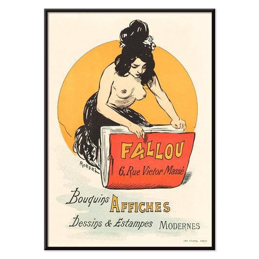
Fallou Poster
Auguste Roedel · 1888 · Paris bookshop poster featuring a red book against a bold yellow circle
Plakat od 40,50 zł · W ramce od 72 zł
Cena regularna Od 27,00 złCena regularna -
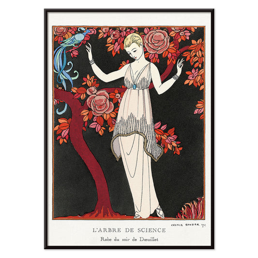
L'Arbre de science Poster
George Barbier · 1914 · Elegant Art Deco fashion poster featuring a poised woman beneath a flowering tree
Plakat od 40,50 zł · W ramce od 72 zł
Cena regularna Od 27,00 złCena regularna -
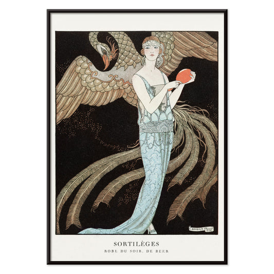
Sortilèges Poster
George Barbier · 1922 · Elegant Art Deco fashion poster featuring a flowing blue gown and majestic bird
Plakat od 40,50 zł · W ramce od 72 zł
Cena regularna Od 27,00 złCena regularna -
Chez la Marchande de Pavots Poster
George Barbier · 1920 · Art Deco poster with lounging figures and a blue dragon in bold red accents
Plakat od 40,50 zł · W ramce od 72 zł
Cena regularna Od 27,00 złCena regularna -
Chinese landscape Poster
Lan Ying · 1279 · Misty mountain landscape art print with warm red foliage and spacious ink washes
Plakat od 40,50 zł · W ramce od 72 zł
Cena regularna Od 27,00 złCena regularna -
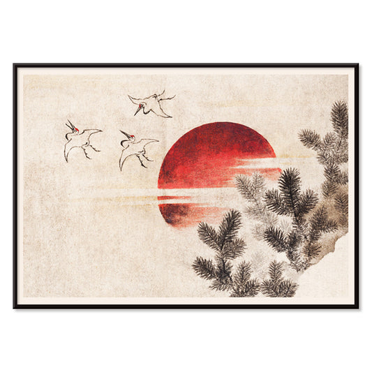
Birds and sunset Poster
Katsushika Hokusai · 1814 · Serene poster of cranes flying toward a red sun over a warm beige sky
Plakat od 40,50 zł · W ramce od 72 zł
Cena regularna Od 27,00 złCena regularna -
Talismanic tiger Poster
Unknown artist · 1950 · Talismanic tiger poster with bold ink stripes and alert gaze on warm beige
Plakat od 40,50 zł · W ramce od 72 zł
Cena regularna Od 27,00 złCena regularna -
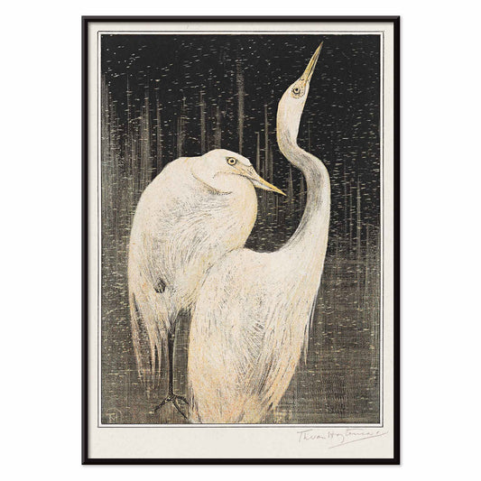
Twee zilverreigers Poster
Theo van Hoytema · 1892 · Elegant egret print with delicate linework and dramatic black background
Plakat od 40,50 zł · W ramce od 72 zł
Cena regularna Od 27,00 złCena regularna -
Positions of the Hands Poster
Joseph Gibbons Richardson · 1910 · Educational sign language poster charting hand positions in crisp black linework
Plakat od 40,50 zł · W ramce od 72 zł
Cena regularna Od 27,00 złCena regularna -
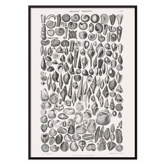
Organic Remains Poster
Oliver Goldsmith · 1820 · Detailed fossil shell scientific print with crisp black linework on white ground
Plakat od 40,50 zł · W ramce od 72 zł
Cena regularna Od 27,00 złCena regularna -
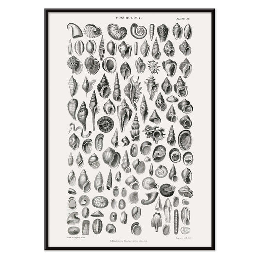
Conchology Poster
Oliver Goldsmith · 1820 · Detailed seashell scientific print with crisp linework and an orderly specimen layout
Plakat od 40,50 zł · W ramce od 72 zł
Cena regularna Od 27,00 złCena regularna -
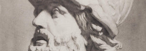
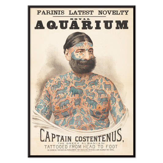
Captain Costentenus Poster
Unknown artist · 1833 · Dramatic tattooed portrait poster with bold typography on warm beige ground
Plakat od 40,50 zł · W ramce od 72 zł
Cena regularna Od 27,00 złCena regularna -
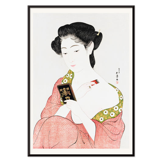
Woman Applying Rouge Poster
Goyō Hashiguchi · 1920 · Intimate bijin ga print of a woman applying rouge in a quiet daily ritual
Plakat od 40,50 zł · W ramce od 72 zł
Cena regularna Od 27,00 złCena regularna -
Yatsuo no tsubaki Poster
Taguchi Tomoki · 1865 · Serene camellia and bird vintage print with spacious Japanese woodblock composition
Plakat od 40,50 zł · W ramce od 72 zł
Cena regularna Od 27,00 złCena regularna -
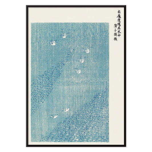
Seagulls from Yatsuo no tsubaki Poster
Taguchi Tomoki · 1865 · Elegant seagulls poster with birds soaring above stylized blue water in Japanese woodblock style
Plakat od 40,50 zł · W ramce od 72 zł
Cena regularna Od 27,00 złCena regularna -
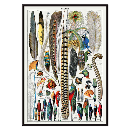
Feathers Poster
Adolphe Millot · 1900 · Detailed feather types print arranged like a specimen board with labeled forms
Plakat od 40,50 zł · W ramce od 72 zł
Cena regularna Od 27,00 złCena regularna -
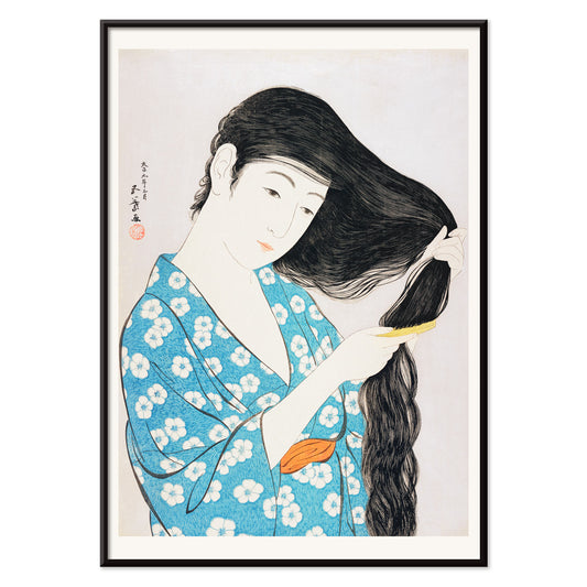
Woman Combing Her Hair Poster
Goyō Hashiguchi · 1920 · Quiet shin-hanga art print of a woman combing long hair in a blue kimono
Plakat od 40,50 zł · W ramce od 72 zł
Cena regularna Od 27,00 złCena regularna -
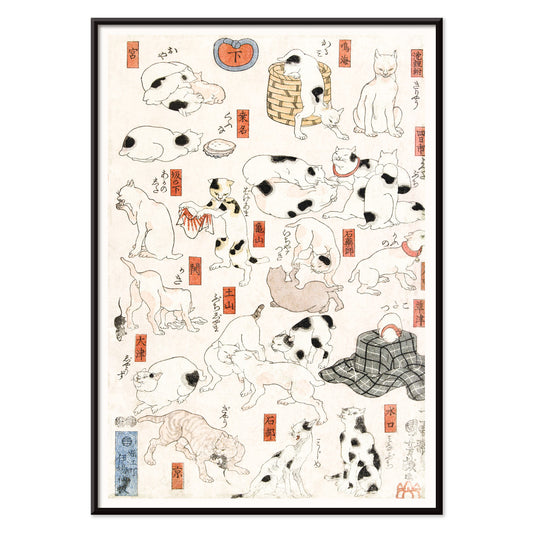
Cats Poster
Utagawa Kuniyoshi · 1849 · Playful ukiyo-e cats print showing varied poses with crisp ink lines and red accents
Plakat od 40,50 zł · W ramce od 72 zł
Cena regularna Od 27,00 złCena regularna -
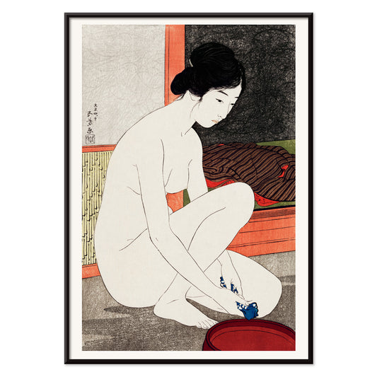
Woman After a Bath Poster
Goyō Hashiguchi · 1920 · Serene bijin art print capturing a private bathing ritual in delicate shin hanga tones
Plakat od 40,50 zł · W ramce od 72 zł
Cena regularna Od 27,00 złCena regularna -
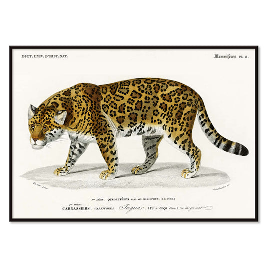
Panthera Onca Poster
Charles Dessalines D'Orbigny · 1856 · Detailed jaguar print with bold rosettes and a poised, watchful profile
Plakat od 40,50 zł · W ramce od 72 zł
Cena regularna Od 27,00 złCena regularna -
Woman Applying Powder Poster
Goyō Hashiguchi · 1918 · Elegant bijin-ga art print of a woman powdering her face in quiet morning light
Plakat od 40,50 zł · W ramce od 72 zł
Cena regularna Od 27,00 złCena regularna -
Yokugo no onna Poster
Goyō Hashiguchi · 1915 · Refined bathing beauty art print with pale skin, dark hair, and vermilion accents
Plakat od 40,50 zł · W ramce od 72 zł
Cena regularna Od 27,00 złCena regularna -
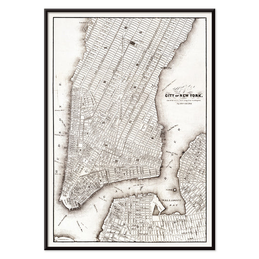
Map of the city of New York Poster
Unknown artist · 1850 · Detailed New York City map vintage print with dense street grid and waterfront outlines
Plakat od 40,50 zł · W ramce od 72 zł
Cena regularna Od 27,00 złCena regularna -
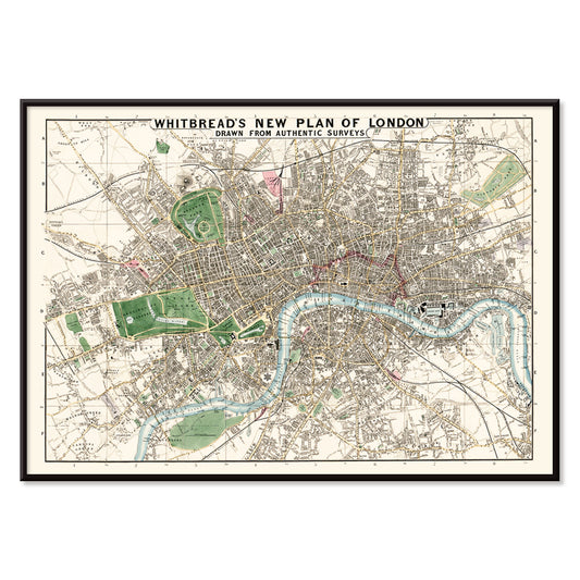
Whitbread new plan of London Poster
J. Whitbread · 1853 · Detailed London map poster with Thames curves and highlighted streets on warm beige
Plakat od 40,50 zł · W ramce od 72 zł
Cena regularna Od 27,00 złCena regularna -
Au Lido Poster
George Barbier · 1920 · Elegant Art Deco poster with elongated figures, parasols, and tranquil blue seaside
Plakat od 40,50 zł · W ramce od 72 zł
Cena regularna Od 27,00 złCena regularna -
Surreal illustrations of fishes Poster
Louis Renard · 1754 · Vivid exotic fish print with hand-colored details and theatrical natural history style
Plakat od 40,50 zł · W ramce od 72 zł
Cena regularna Od 27,00 złCena regularna -
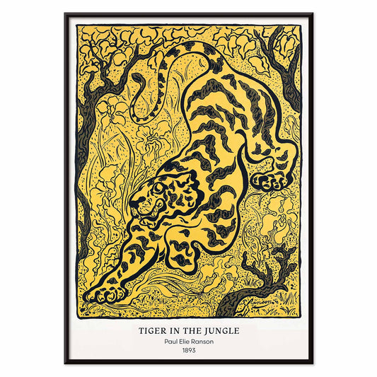
Tiger in the Jungle Poster
Paul Ranson · 1893 · Decorative tiger art print stalking through patterned jungle foliage in Nabi style
Plakat od 40,50 zł · W ramce od 72 zł
Cena regularna Od 27,00 złCena regularna -
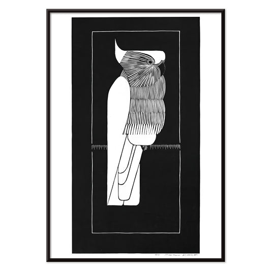
Kroonkaketoe Poster
Samuel Jessurun de Mesquita · 1924 · High-contrast cockatoo poster in crisp black-and-white linework with Art Deco poise
Plakat od 40,50 zł · W ramce od 72 zł
Cena regularna Od 27,00 złCena regularna -
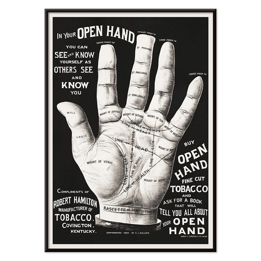
Palm reading Poster
Unknown artist · 2015 · Vintage-inspired palmistry poster featuring an open hand diagrammed with intricate black lines
Plakat od 40,50 zł · W ramce od 72 zł
Cena regularna Od 27,00 złCena regularna -
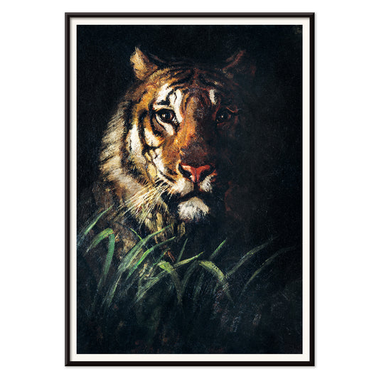
Tiger's Head Poster
Abbott Handerson Thayer · 1911 · Expressive tiger head art print with dark stripes and warm brown fur
Plakat od 40,50 zł · W ramce od 72 zł
Cena regularna Od 27,00 złCena regularna -
Wild animal Poster
Richard Lydekker · 1900 · Vintage print of big cats in profile with warm ochre and brown tones
Plakat od 40,50 zł · W ramce od 72 zł
Cena regularna Od 27,00 złCena regularna -
Parakeets Poster
Samuel Jessurun de Mesquita · 1927 · Striking parakeets poster in crisp black and white with geometric Art Deco rhythm
Plakat od 40,50 zł · W ramce od 72 zł
Cena regularna Od 27,00 złCena regularna -
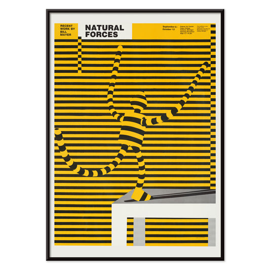
Natural forces Poster
Bill Mayer · 1995 · Surreal striped figure poster cut by kinetic black bands and bright yellow charge
Plakat od 40,50 zł · W ramce od 72 zł
Cena regularna Od 27,00 złCena regularna -
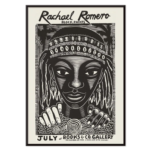
Block prints Poster
Rachael Romero · 1953 · Graphic black-and-white poster of a braided figure framed by rhythmic abstract motifs
Plakat od 40,50 zł · W ramce od 72 zł
Cena regularna Od 27,00 złCena regularna -
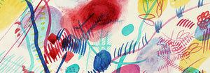
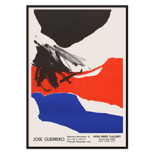
Rose Fried Gallery Poster
José Guerrero · 1963 · Energetic abstract poster balancing black, red, and blue gestures on white space
Plakat od 40,50 zł · W ramce od 72 zł
Cena regularna Od 27,00 złCena regularna -
Wake up and read Poster
Unknown artist · 1961 · Modernist reading campaign poster with bold typography and crisp red and blue contrast
Plakat od 40,50 zł · W ramce od 72 zł
Cena regularna Od 27,00 złCena regularna -
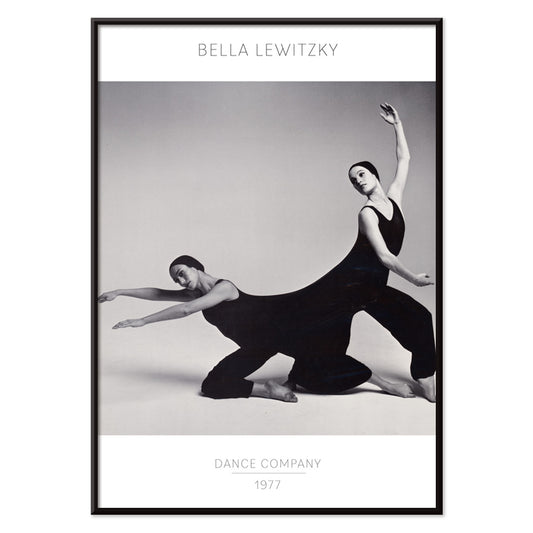
Bella Lewitzky Dance Company Poster
Unknown artist · 1977 · High-contrast modern dance poster combining striking figure photography with clean, confident typography
Plakat od 40,50 zł · W ramce od 72 zł
Cena regularna Od 27,00 złCena regularna -
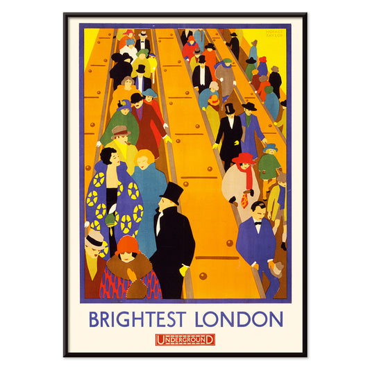
Brightest London 2 Poster
Horace Taylor · 1924 · Dynamic London Underground poster of escalator crowds in bold Art Deco color blocks
Plakat od 40,50 zł · W ramce od 72 zł
Cena regularna Od 27,00 złCena regularna -
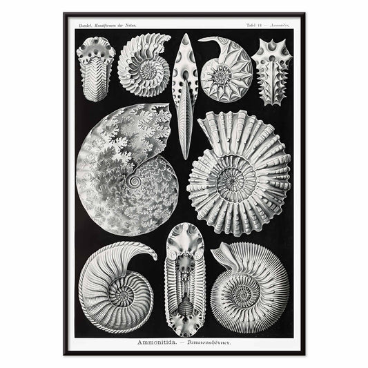
Ammonitida Poster
Ernst Haeckel · 1904 · Detailed ammonite print presenting spiraled shells with crisp scientific linework
Plakat od 40,50 zł · W ramce od 72 zł
Cena regularna Od 27,00 złCena regularna -
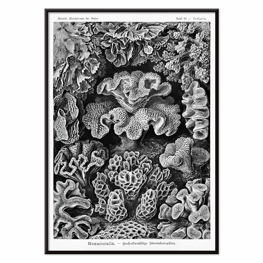
Hexacoralla Poster
Ernst Haeckel · 1904 · Intricate hexacoral scientific print showcasing radial marine forms in crisp black linework
Plakat od 40,50 zł · W ramce od 72 zł
Cena regularna Od 27,00 złCena regularna -
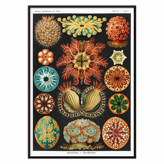
Ascidiae Poster
Ernst Haeckel · 1904 · Intricate sea squirt scientific print arranged in a striking symmetrical natural history plate
Plakat od 40,50 zł · W ramce od 72 zł
Cena regularna Od 27,00 złCena regularna -
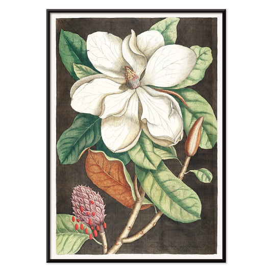
Magnolia altissima Poster
Mark Catesby · 1754 · Elegant magnolia botanical print with glossy green leaves and creamy white bloom
Plakat od 40,50 zł · W ramce od 72 zł
Cena regularna Od 27,00 złCena regularna -
Laurel Tree Poster
Mark Catesby · 1754 · Elegant laurel botanical print with slender branch, glossy leaves, and delicate blooms
Plakat od 40,50 zł · W ramce od 72 zł
Cena regularna Od 27,00 złCena regularna -
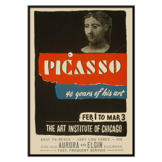
Picasso - 40 years of his art Poster
Art Institute of Chicago · 1970 · Striking exhibition poster with bold typography and modern abstract figure in red and blue
Plakat od 40,50 zł · W ramce od 72 zł
Cena regularna Od 27,00 złCena regularna -
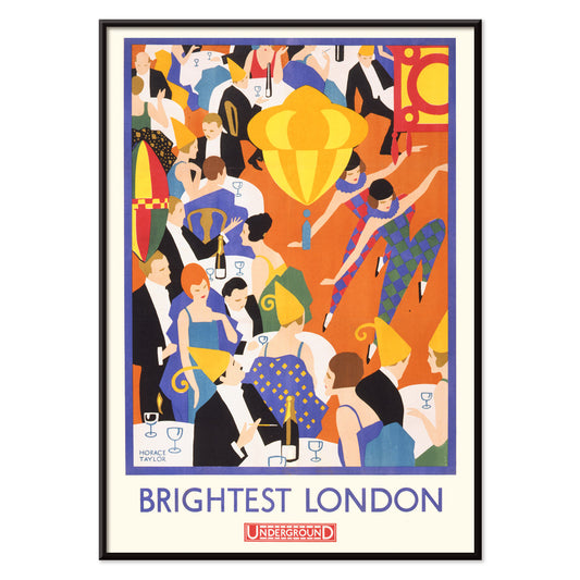
Brightest London Poster
Horace Taylor · 1924 · Energetic London nightlife poster with glowing lights and streamlined Underground era lettering
Plakat od 40,50 zł · W ramce od 72 zł
Cena regularna Od 27,00 złCena regularna -
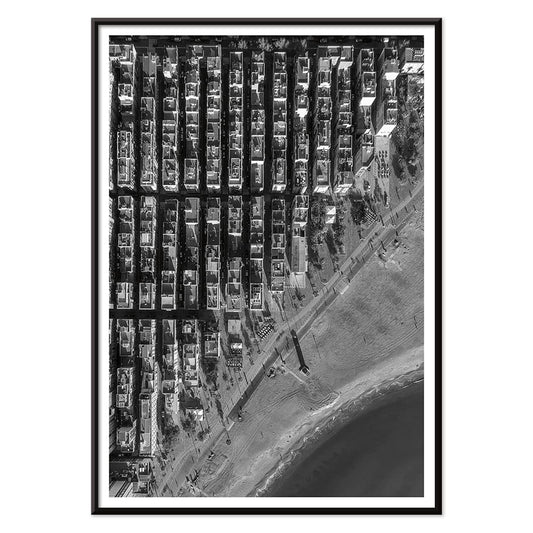
Barceloneta Poster
Unknown artist · 1992 · High-contrast aerial Barceloneta poster balancing tight city grids with open Mediterranean water
Plakat od 40,50 zł · W ramce od 72 zł
Cena regularna Od 27,00 złCena regularna -
Santorini Poster
Unknown artist · 2004 · Monochrome Santorini church dome poster capturing the cross silhouette against open Aegean sky
Plakat od 40,50 zł · W ramce od 72 zł
Cena regularna Od 27,00 złCena regularna -
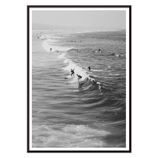
Surfers in Venice Beach Poster
Unknown artist · 2011 · Black-and-white surf art print showing surfers carrying boards along Venice Beach
Plakat od 40,50 zł · W ramce od 72 zł
Cena regularna Od 27,00 złCena regularna -
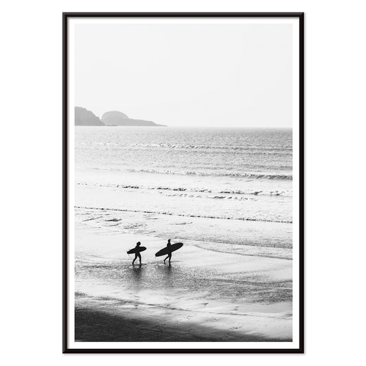
Surfers walking on the beach Poster
Unknown artist · 1976 · Black and white surfers poster with figures carrying boards along the shoreline
Plakat od 40,50 zł · W ramce od 72 zł
Cena regularna Od 27,00 złCena regularna -
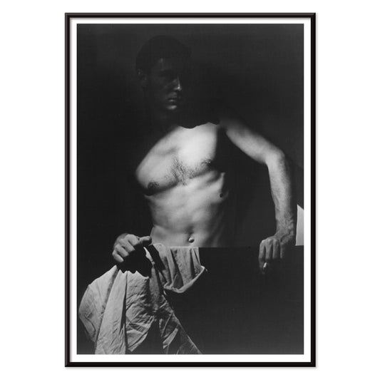
Max After Surfing Poster
Olive Cotton · 1939 · Luminous black-and-white art print of a surfer's torso sculpted by dramatic light
Plakat od 40,50 zł · W ramce od 72 zł
Cena regularna Od 27,00 złCena regularna -
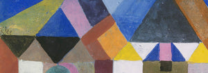
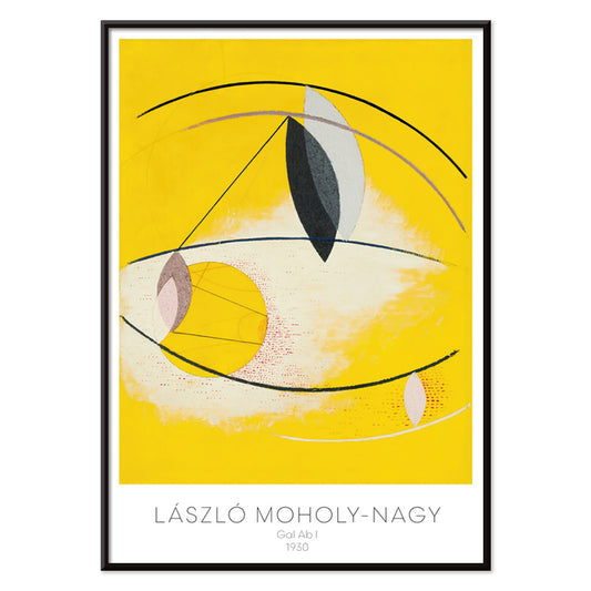
Gal Ab I Poster
László Moholy-Nagy · 1930 · Dynamic Bauhaus poster balancing circles and diagonals with bright yellow and deep black
Plakat od 40,50 zł · W ramce od 72 zł
Cena regularna Od 27,00 złCena regularna -
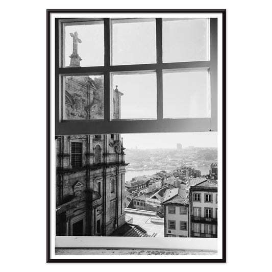
Porto Poster
Unknown artist · 2020 · Black and white Porto cityscape poster with crisp lines and a contemplative window view
Plakat od 40,50 zł · W ramce od 72 zł
Cena regularna Od 27,00 złCena regularna -
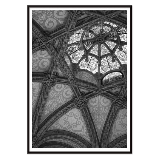
Hospital de Sant Pau Poster
Unknown artist · 1901 · Monochrome architectural poster capturing Sant Pau vaulted ceilings with dramatic light and shadow
Plakat od 40,50 zł · W ramce od 72 zł
Cena regularna Od 27,00 złCena regularna -
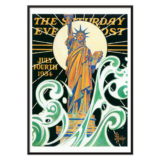
Statue of Liberty Poster
J. C. Leyendecker · 1918 · Patriotic Statue of Liberty poster with sunburst rays above stylized ocean waves
Plakat od 40,50 zł · W ramce od 72 zł
Cena regularna Od 27,00 złCena regularna -
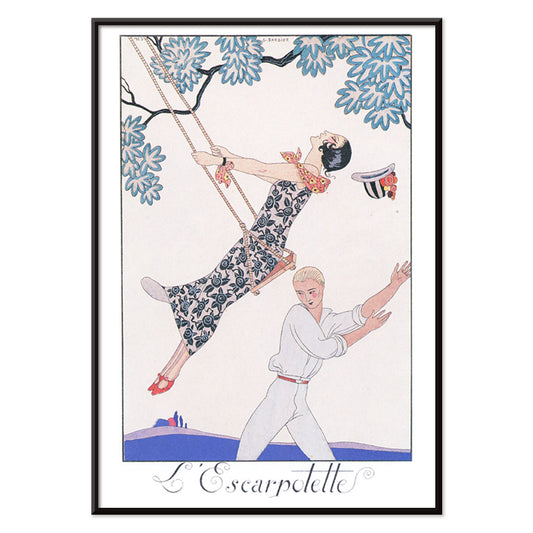
L’Escarpotette Poster
George Barbier · 1924 · Playful Art Deco poster of a chic figure on a swing in blue
Plakat od 40,50 zł · W ramce od 72 zł
Cena regularna Od 27,00 złCena regularna -
United we are strong Poster
Henry Koerner · 1943 · WWII poster featuring Allied flags rising above cannons in bold graphic style
Plakat od 40,50 zł · W ramce od 72 zł
Cena regularna Od 27,00 złCena regularna


72/840 items
- Two seated women Poster
- Suidobashi Bridge and Surugadai Poster
- Family Dogs Poster
- Fishing Boats Poster
- Fallou Poster
- Chinese landscape Poster
- Birds and sunset Poster
- Talismanic tiger Poster
- Captain Costentenus Poster
- Woman Applying Rouge Poster
- Yatsuo no tsubaki Poster
- Seagulls from Yatsuo no tsubaki Poster
- Feathers Poster
- Woman Combing Her Hair Poster
- Cats Poster
- Woman After a Bath Poster
- Panthera Onca Poster
- Woman Applying Powder Poster
- Yokugo no onna Poster
- Map of the city of New York Poster
- Whitbread new plan of London Poster
- Au Lido Poster
- Surreal illustrations of fishes Poster
- Palm reading Poster
- Tiger's Head Poster
- Wild animal Poster
- Parakeets Poster
- Natural forces Poster
- Block prints Poster
- Rose Fried Gallery Poster
- Wake up and read Poster
- Ammonitida Poster
- Hexacoralla Poster
- Brightest London Poster
- Barceloneta Poster
- Surfers in Venice Beach Poster
- Surfers walking on the beach Poster
- Porto Poster
- Hospital de Sant Pau Poster
Black as structure in vintage poster design
Black often behaves less like a colour and more like a framework. In vintage poster design, it sharpens edges, steadies ornament, and gives breathing space to colour. This Black collection gathers posters where darkness appears as ink, silhouette, night sky, or typographic spine, an editorial filter rather than a monochrome rule. It is a useful thread for wall art and decoration, especially when you want a room to feel composed without feeling severe. Pair these prints with materials that already carry a dark note, such as iron hardware, a matte lamp base, or a charcoal textile, and the rest of the palette reads more intentional.
How artists used black to hold the image together
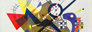
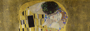
In Gustav Klimt’s The Kiss (1907–1908), black works like velvet behind the gold, making the surface feel lit from within and helping the ornament stay legible. Théophile Alexandre Steinlen’s Tournée du Chat Noir (1896) turns a flat midnight field into theatre, proving how silhouette can carry character and humour with almost no modelling. Modernist balance comes through in Wassily Kandinsky’s Circles in a Circle (1923), where black lines act as a scaffold for colour and motion. Even advertising bravura depends on darkness: Leonetto Cappiello’s Vermouth Martini (1920) uses deep shadow to make citrus yellow and skin tones snap into focus, a classic poster trick for instant readability.
Placing black-accent wall art in home decor
Because black reads as structure, these poster choices suit spaces that benefit from visual order: entryways, kitchens, and work corners. Against pale walls, black-accent prints look crisp and architectural; against saturated paint, they create tension and depth. In bedrooms, a dark outline or border can quiet a busy palette, while in dining rooms it behaves like a tailored jacket, giving candlelight and ceramics a clearer stage. For high-contrast companions, see Black & White; for restrained compositions, Minimalist keeps the rhythm clean. If you prefer period graphics and signage energy, Advertising adds bold lettering and dramatic figure-ground play.
Curating pairings, subjects, and frames
On a mixed gallery wall, let black be the repeating note: one graphic poster, one figurative plate, one abstract print. A wildlife sheet like Abbott Handerson Thayer’s Tiger’s Head (1911) brings dense brushwork and shadowed fur that sits naturally with brass, leather, and dark wood. For measured spacing and typographic discipline, mix in geometry from Bauhaus; for natural subjects, Animals keeps imagery coherent while still letting black linework recur. If you want a more symbolic register, Esoteric introduces tarot-like borders, stars, and diagrams that echo scientific line culture. Framing matters: black ash or thin walnut can mirror the ink without making the room heavy, while a generous white mat adds air around intricate contours and small type.
A dark accent that stays flexible
Black details are often what persist in memory: the outline of a cat, a modernist grid, the thin border around a label. Treat this collection as a tool for decoration, choosing one vintage print to anchor a room and letting colour, texture, and light shift around it over time. When black is used as a finishing note rather than a statement, posters feel less like period nostalgia and more like clear-eyed design.